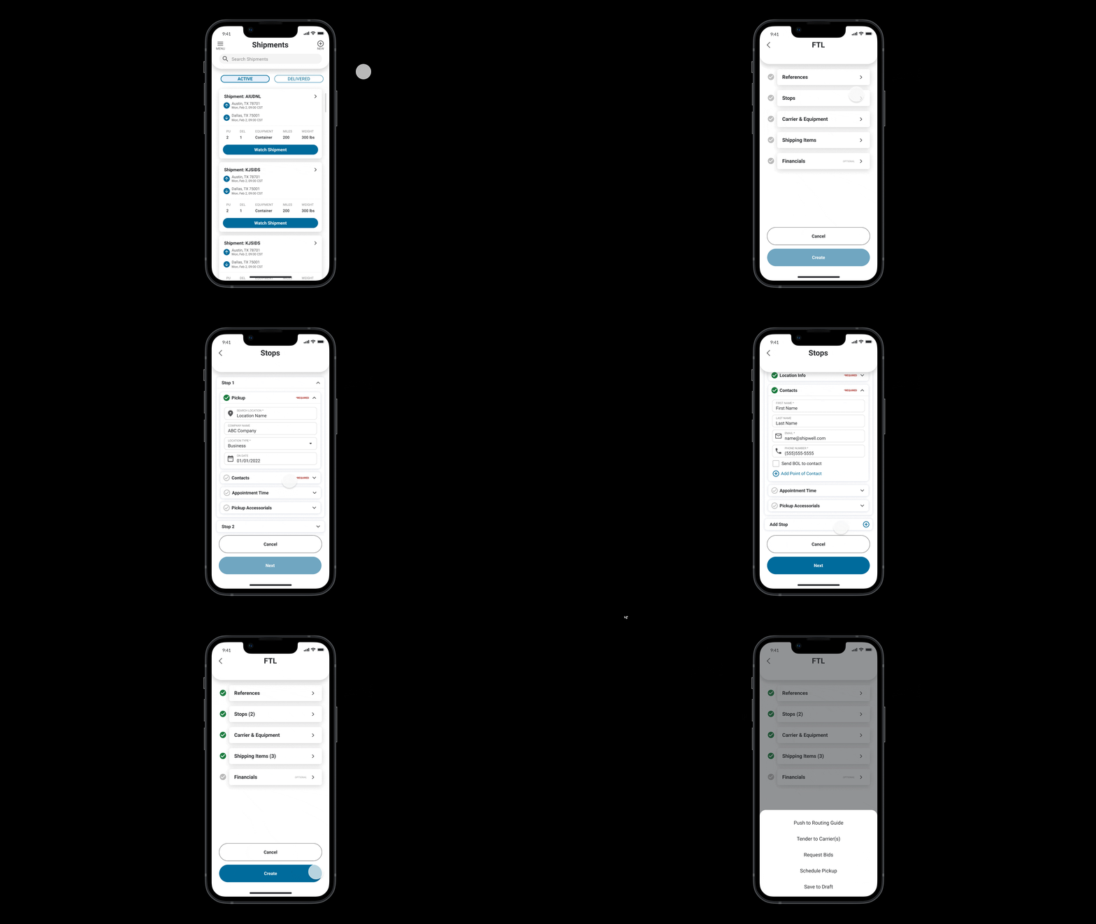

Creating a shipment is the first step of transportation. Shipwell provides multiple methods to create a shipment on the web end, including importing, cloning, and creating from scratch. However, the shipper couldn’t create shipments on Shipwell mobile app. The app was built for tracking at first, with various features for drivers, but not for shippers. In fact, over 800 users per day use Shipwell on mobile browsers.
After speaking with customers, we have found a series of improvements we could do to the native app, including adding create shipment feature. The developers built out the first version, however when we tested it with the CSM team, many problems were found, so we decided to redesign it in a concise time.
UX Design
Visual Design
User Research & Testing
User Flows
Wire-Frames
User Testing
Visual Design
Prototype
Figma
Jira
TestFlight
Fullstory
Here is the existing design. We created a spreadsheet with the feedback from the stakeholders and shared with the team:
Because our product is desktop first, this version used many desktop treatments and components, which is the main reason caused those problems. I summarized the feedback and here are three main pain points. I need to redesign it to solve the problems on a short timeline.
The short timeline. Since the last version was delivered, developers have been building it. I have only one week to redesign it.
I gathered the design team and the product manager to brain storm and solve the problems together. I brought up Turbotax, that’s from my accounting background, and tax forms have complex fields as well. The home page of Turbotax is very clear, users know how many sections they have to fill to complete the entire form.
So I added a home screen for creating shipment, and split the process to five sections: References, Stops, Carrier & Equipment, Shipping Items, and Financials. And also added check marks to inform user the completion status. In each of the section, I put related fields together which can be collapsed, and also with completion check marks.