WEB, MOBILE
Raven
A simple and effective cloud storage product
Raven is a simple and effective cloud storage product with a user-friendly and minimalist design. In this project, I created the homepage, the dashboard, and the log in process with responsive design. I am the designer of this project. I have used Sketch, Invision, Usability Hub, Draw.io, myBalsamiq, and several Google drive apps (Google Docs, Google Sheets, Google Forms, etc.) to complete this project.

UX Design
Visual Design
Brand & Identity
User Research & Testing

User Surveys
Personas
Competitive Analysis
Brand Concept
User Stories & Flows
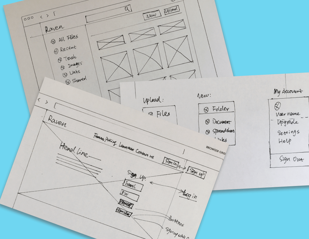
Paper Prototype
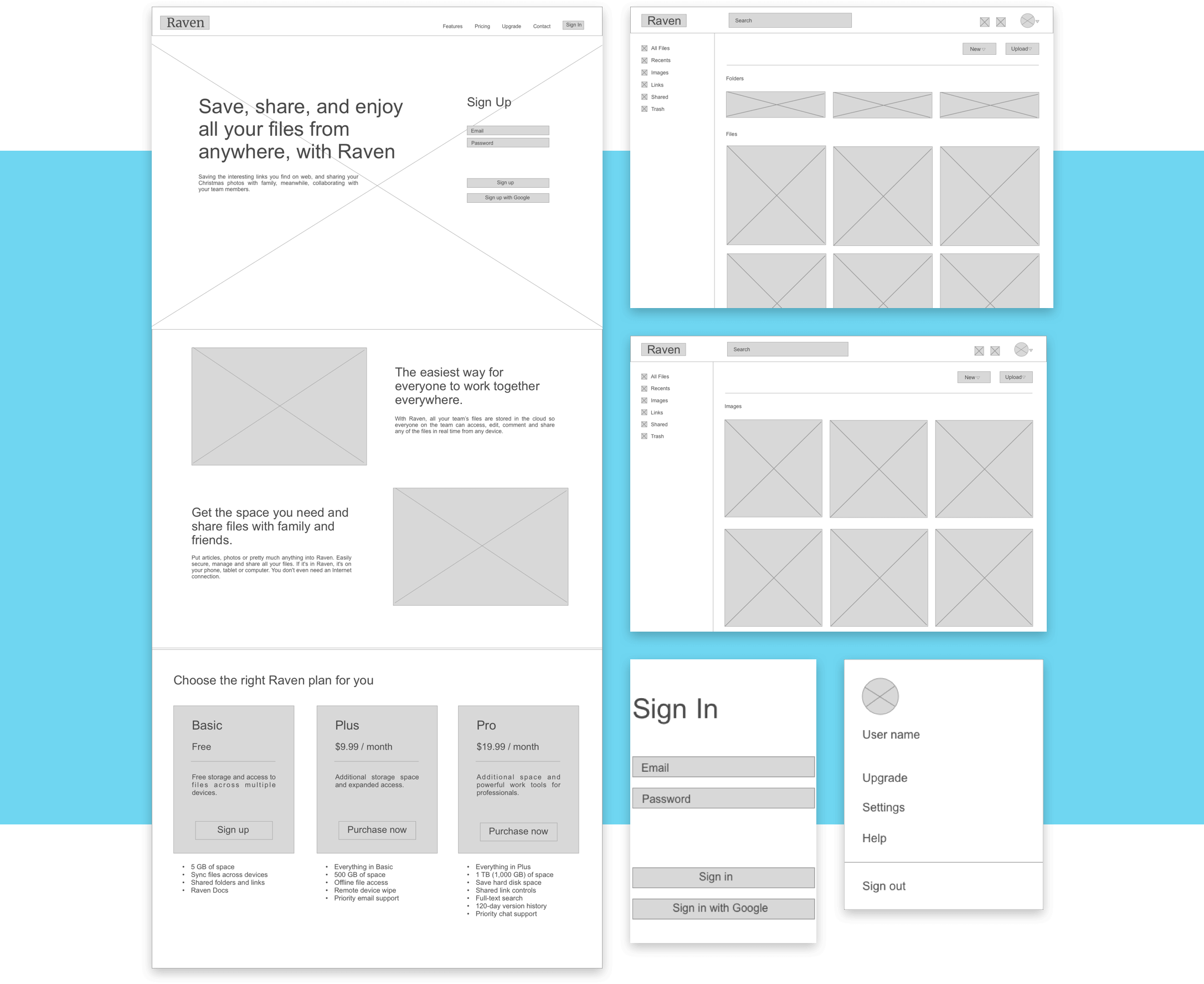
Wire-Frames
User Testing
Visual Design

Sketch
Invision
Usability Hub
Draw.io
myBalsamiq
Google Sheets
Google Forms
The client would like to have a cloud storage product which has multiple features: save, organize, and create files. It needs a homepage to introduce the service, a dashboard of the account, and a logo to express the spirit of this product. The interaction of saving and creating files is another demand. The product should be working on both large and small screens.
In the user research phase, I began with a user survey. One of the primary goals of this survey is determining what features users actually want. The survey is also a great place to augment the competitive analysis by getting users thoughts on the competition.
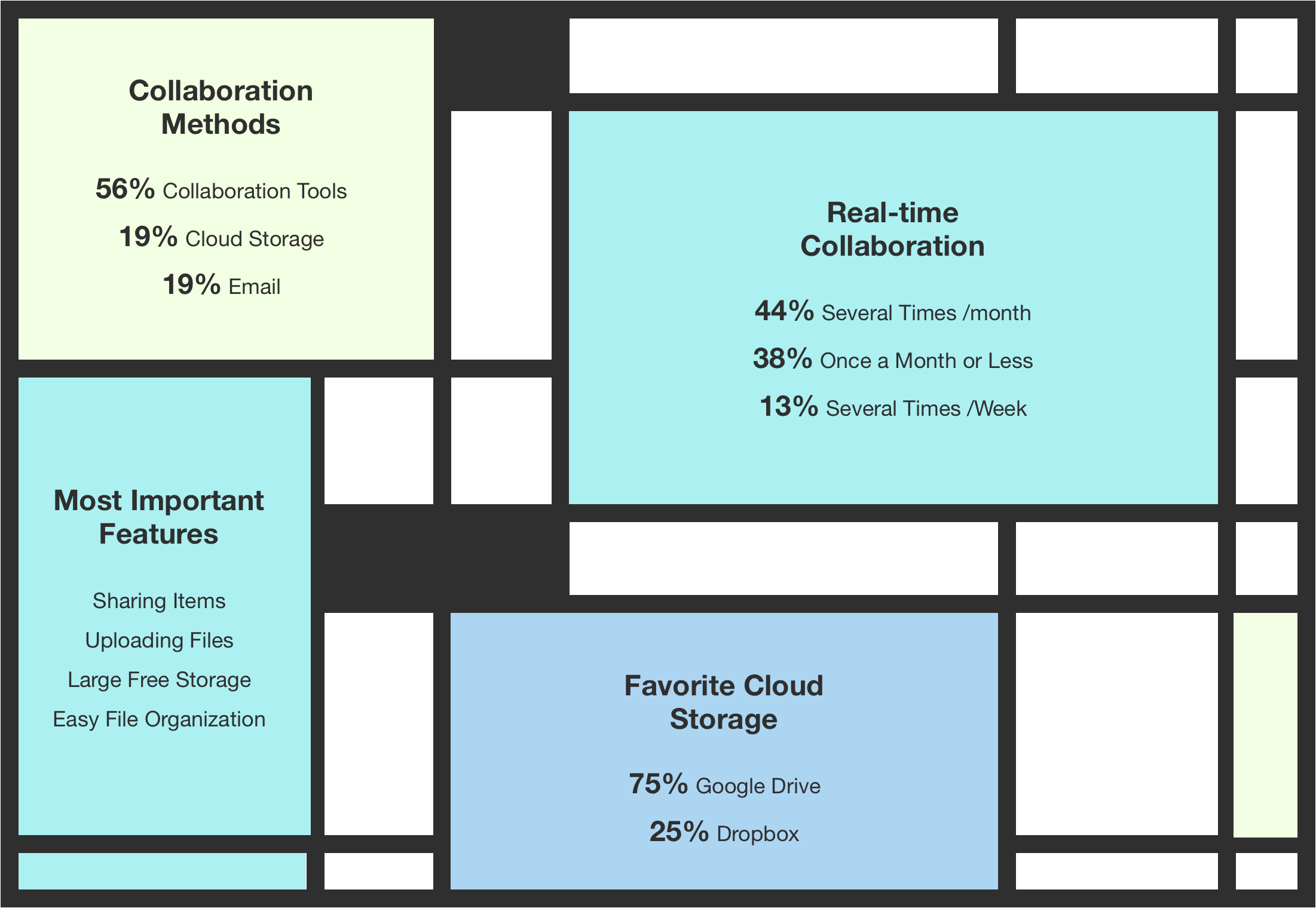
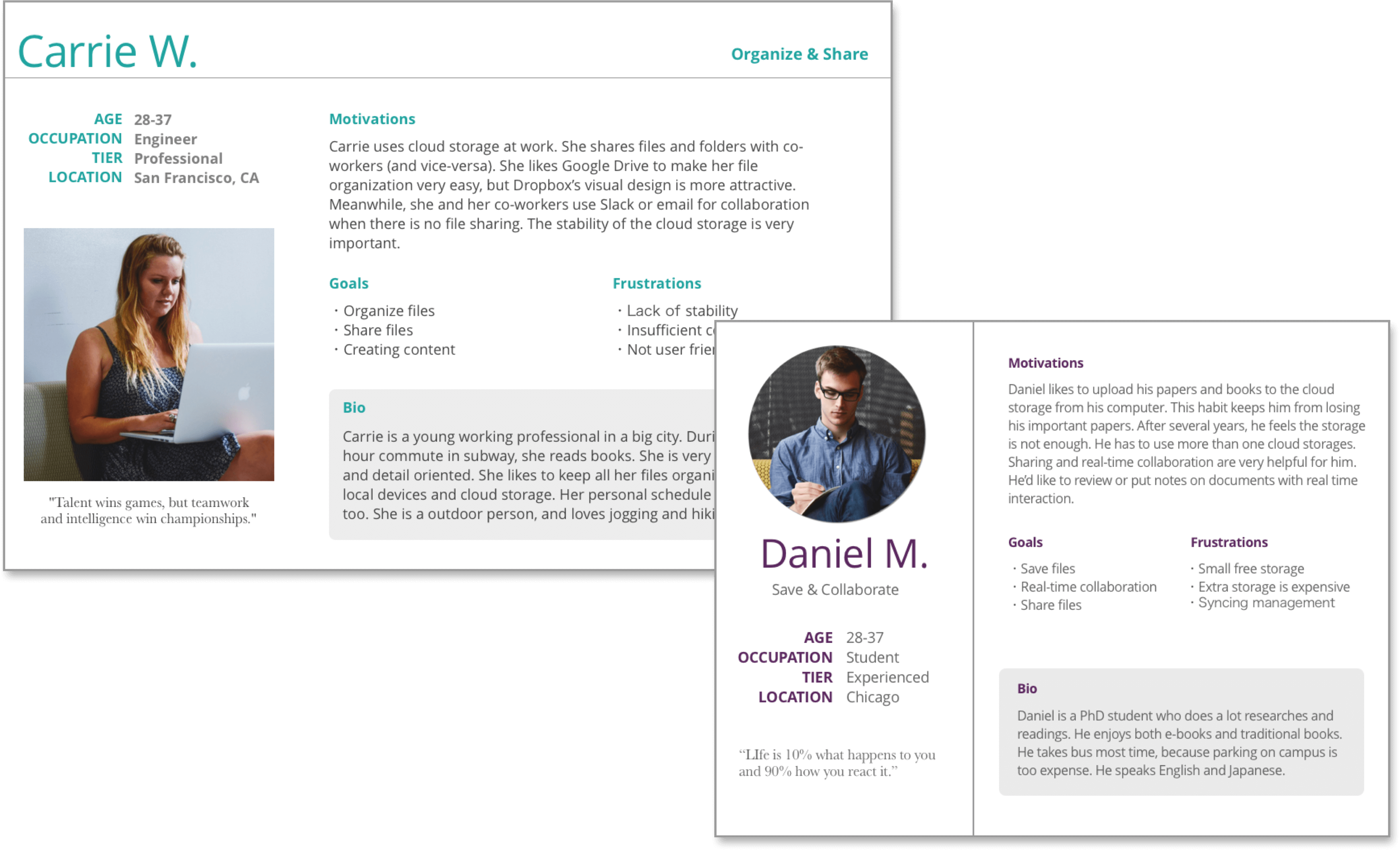
After the analysis of the user survey, I interviewed three users and have developed two user personas.
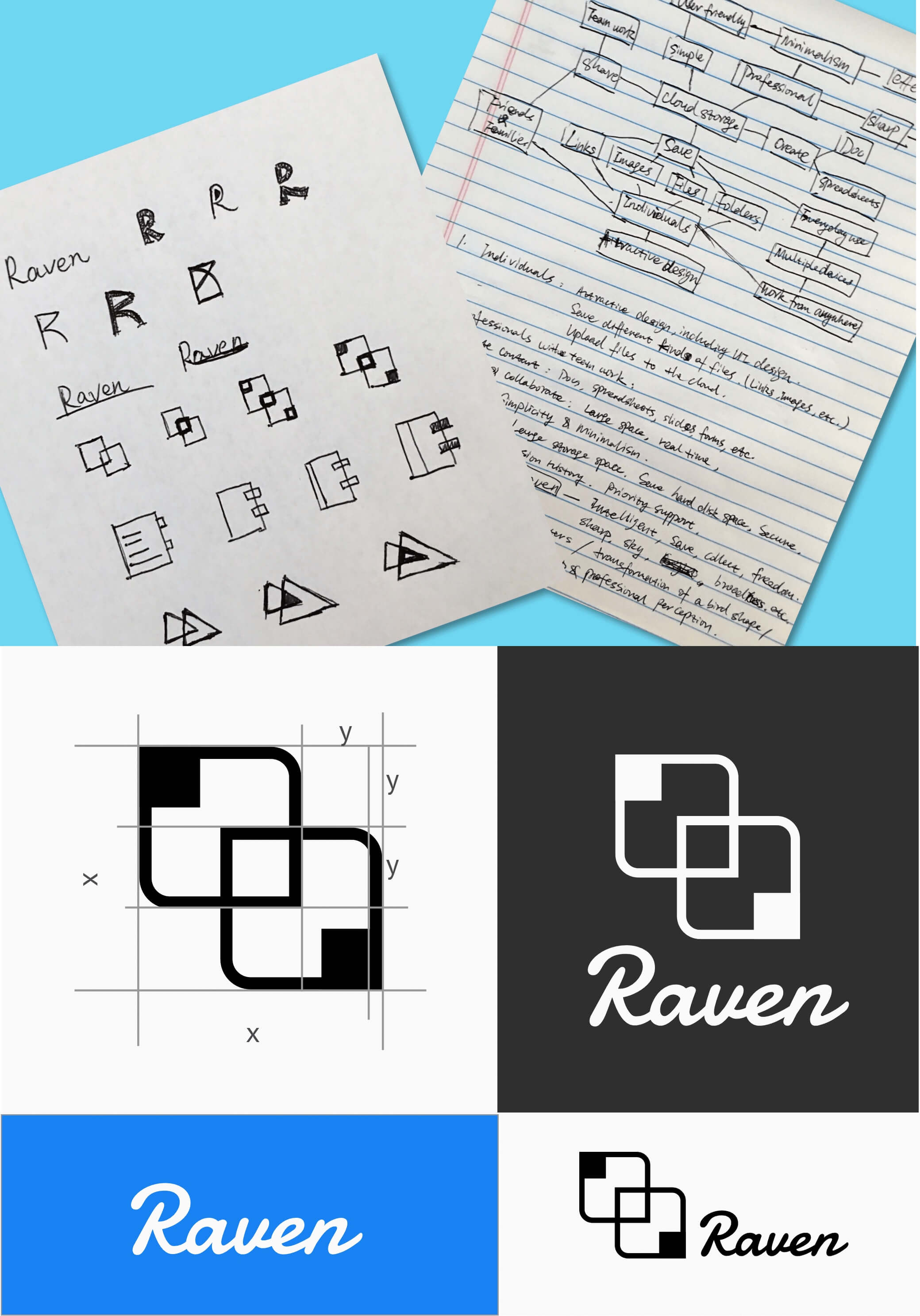
Raven is committed to creating a simple and effective cloud storage product with a user-friendly and minimalist design. The product name, raven, represents the spirit of sharp, intelligence, and curiosity. A raven not only has the common character as other birds, the exploration of broadness sky but has high intelligence and an organized social structure. They work as a team. As you may know, ravens like to collect valuables and keep their belongings safe. All these characteristics let raven become the best representative of our product.
The logo is an integral part of the Raven brand and should be used thoughtfully and consistently. The wordmark should most often be displayed in black/white with or without the logo icon. Our logo can be used either on its own or together with the wordmark which is based on the Damion typeface with the first letter in uppercase giving a sharp and energetic feeling.
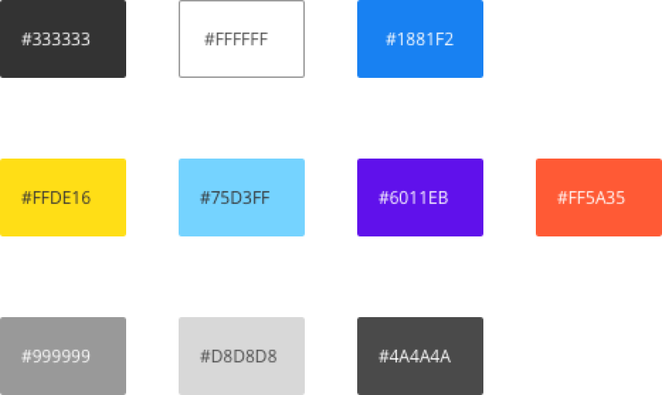
The primary colors of Raven include Dodger Blue, Raven Black, and White. The Dodger Blue represents the bright and intelligent essence of Raven. The Black and White provide the necessary proficiency and reliability. Our accent colors (yellow, purple, blue, and red) provide more ways to highlight and distinguish our product and should be applied sparingly to accent select parts.
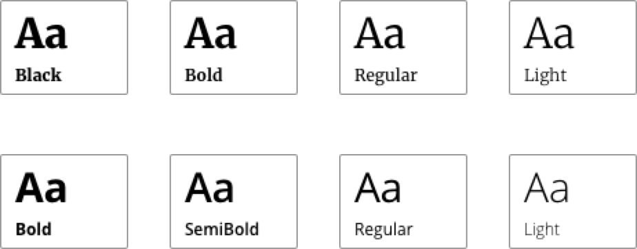
Merriweather is our brand typeface, and it is primarily used for headlines with initial caps. Open Sans is the complementary typeface of Raven. It is optimized for print, web, and mobile interfaces, and have excellent legibility characteristics in its letterforms. It is used for subtitles, body elements, and labels.
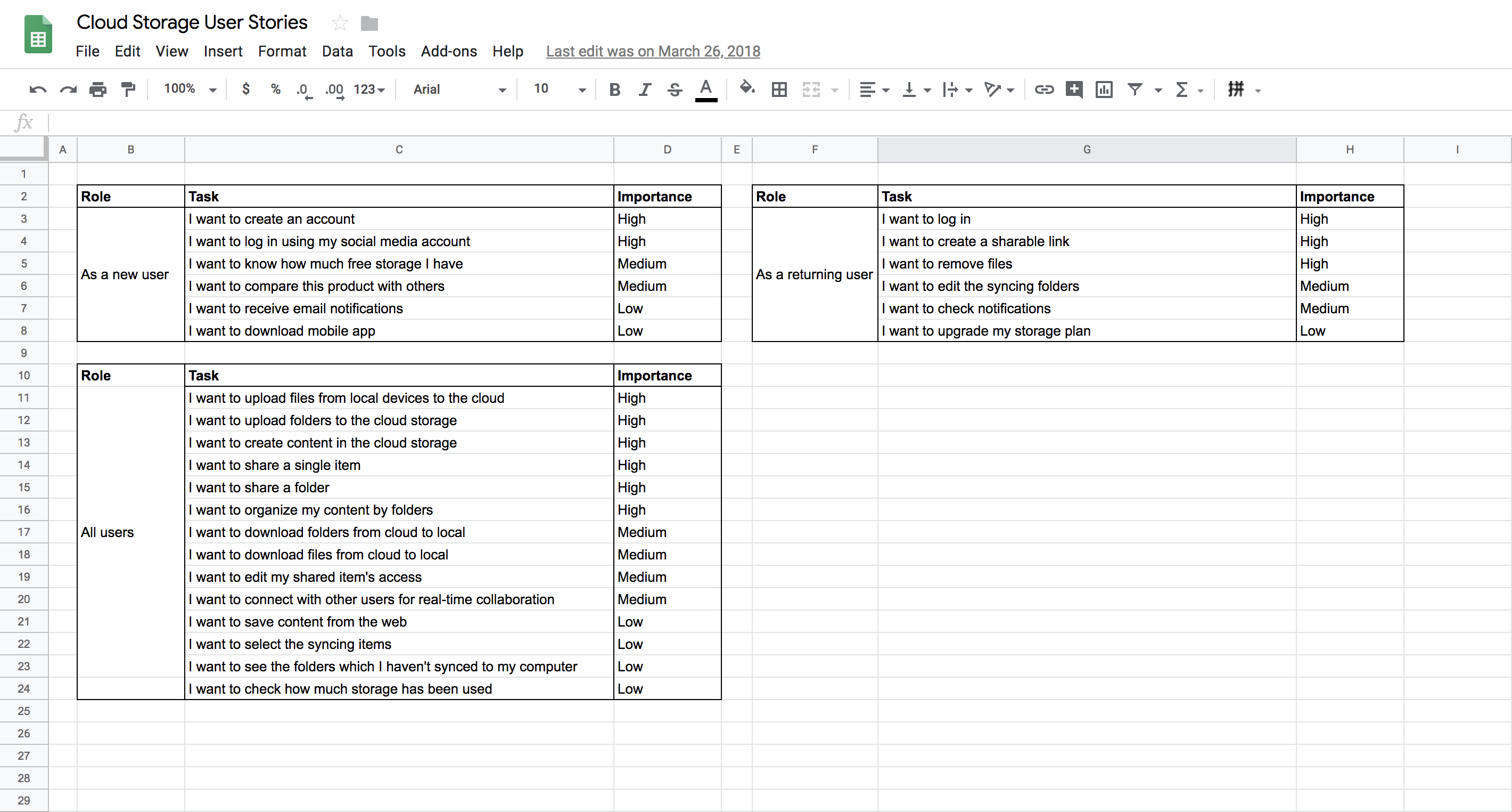
After reviewed my personas again before creating the user stories, I put myself in the shoes of each of those user types and learned about what matters the most to them and what matters the least. Then I created user stories for the new user and return user, and ranked the tasks by importance. User story connects business concerns with the user research. It determines the order in which I will work on things and how long I will work on them. Click for the user stories.
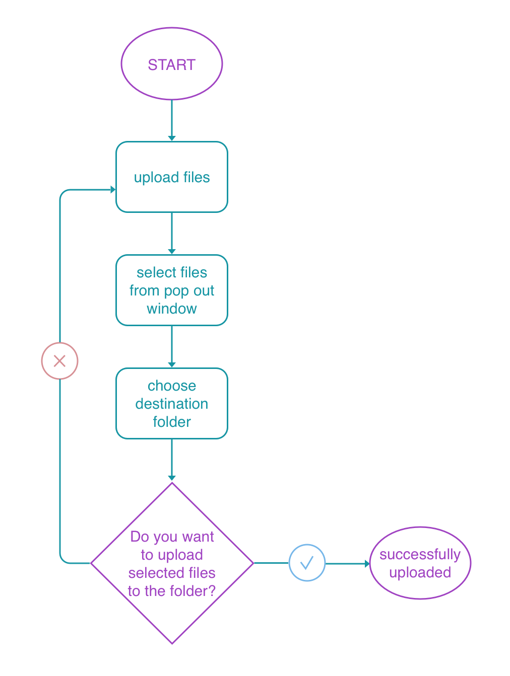
Transforming user stories into user flows is an important step before creating wireframes. I generated several user flows of the high-priority user stories. They are: create an account, sign in, create content, organize content, delete files, upload files, and share items.


Before investing any time in the visual design, wireframes provide me with a map that can be tested on real people and great clarity into how information will be organized on the screen. The goal was keeping my pages simple, clean, and effortless to use. In order to pin down my final design, I first sketched those high priority features and pages with pen and paper. I also tried different styles of the homepage, dashboard, and the sign in page.
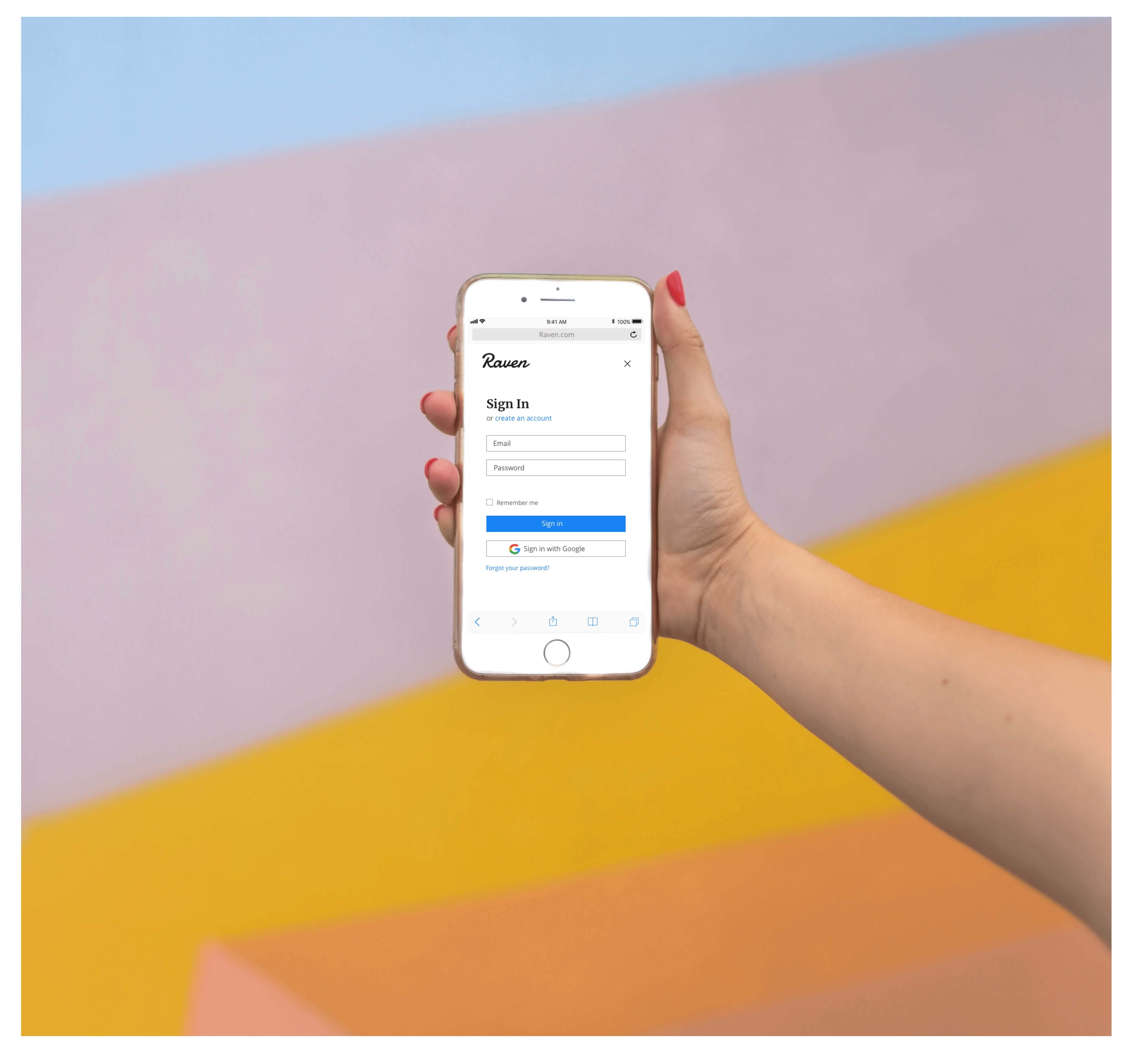
In order to test the features I’ve created, the low-fidelity mockups and prototype was the next step. I added more details on the wireframes and completed the most text content for the going forward user testing. Then I created a prototype with InVision.
I conducted three usability tests of my low-fidelity mockups. My goal was to direct the testers to provide feedback about the overall user experience and how easy or difficult it is to the following tasks:
Based on the feedback, I identified several items could be improved and some other items were approved by users.
I conducted 3 preference tests on Usability Hub to see wether one design favored the other.
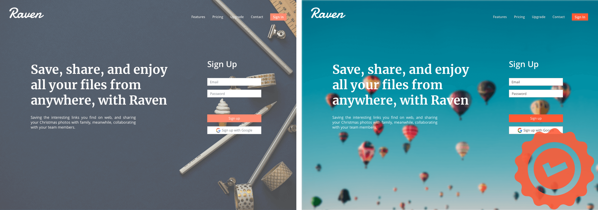
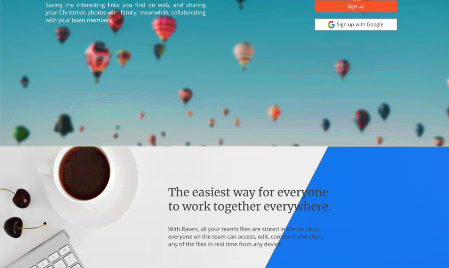
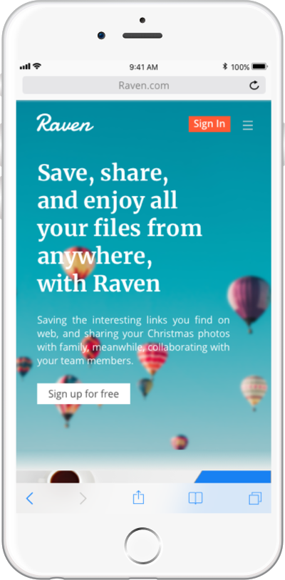
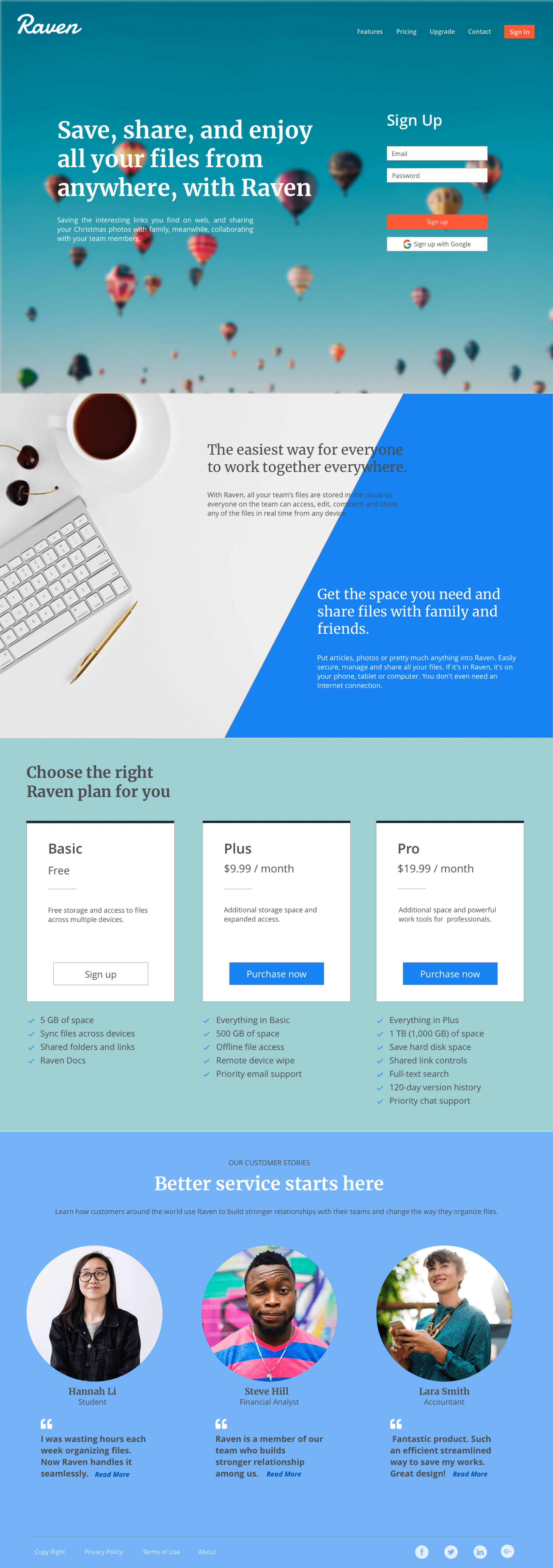
Between the two homepage design, 40% participants chose the dark color background and 60% chose the light color. The main reasons for choosing dark color are: This background looks more professional; The contrast and readability are better; It is concise and clean, which is a better match for a cloud storage website. The reasons people prefer the light color image as the background are: It’s vivid and fresh; It is trendy and more consistent with the rest color of the homepage; The balloons express a feeling of vitality and exploration. My original design is the light color with balloons. I’d like to keep it for a better consistency and expression.
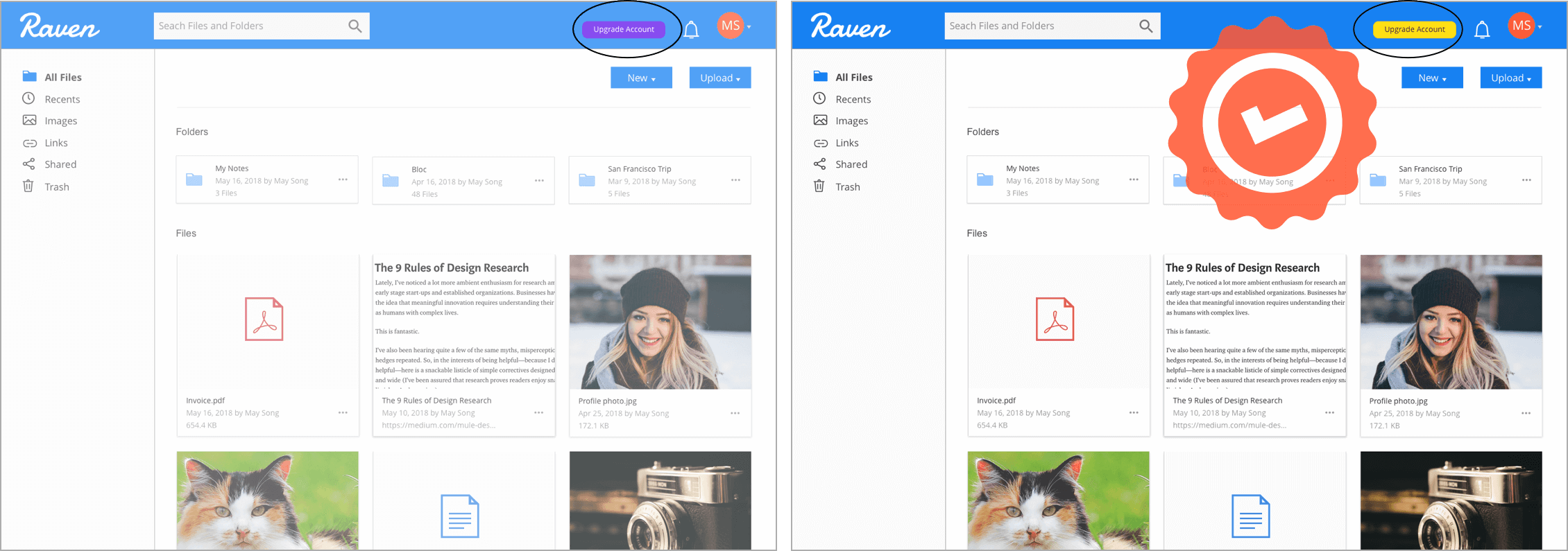
I have created two colors for “update my account” button on the dashboard. Most people (80%) prefer the yellow button. Both of the colors are the accent colors, but with a blue background, yellow gives better contrast, and would easily draw users’ attention. As a result, I would change my original purple button to yellow.
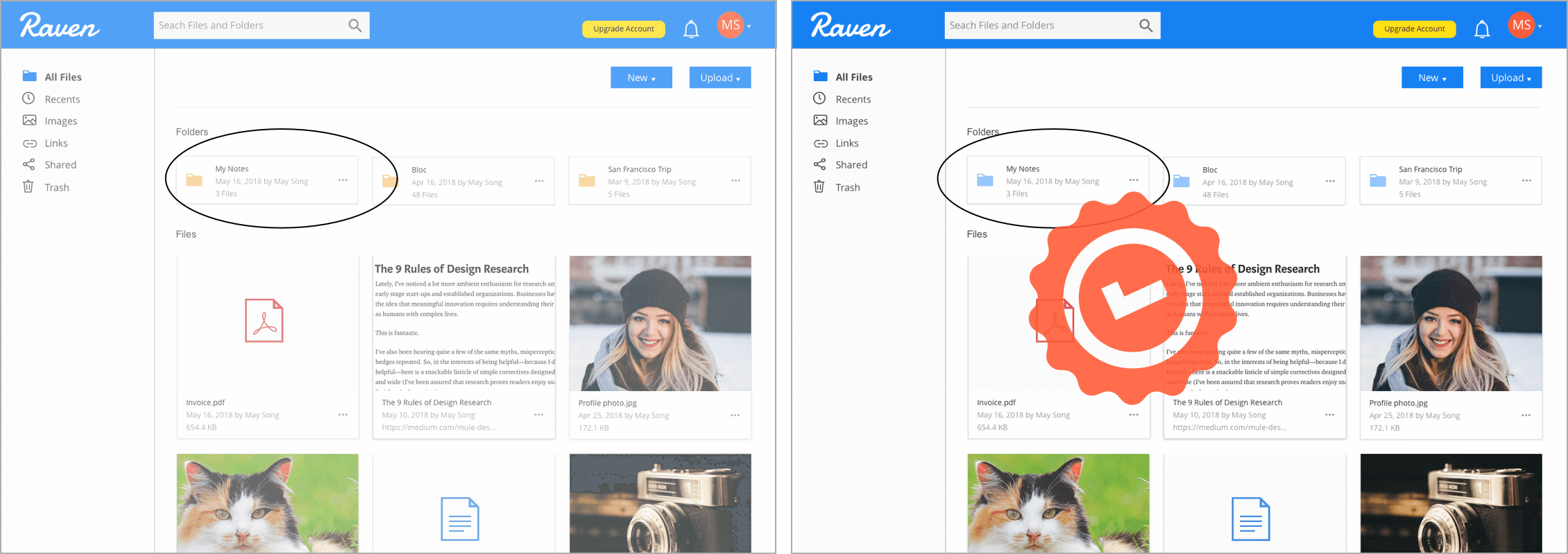
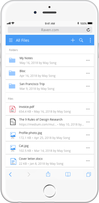
Between the two types of folder icon, I got a draw. The normal yellow kind of folder is a standard folder design. Participants state that it is easily acceptable. They have been seeing this folder everywhere. While the bluish folder is not that classical but trendy and more marked. Users like the folder on the blue theme. I personally prefer the blue folder, since the theme consistency is important.
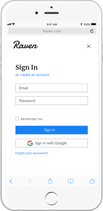
The challenge I ran into was how to assemble the logo and wordmark together on Raven’s website. The combination of the logo and wordmark was not balanced, and there was not enough space for both on the top left corner. The wordmark had provided the sharp and intelligent feeling of this product with the Damion typeface. While I was not that satisfied with the logo. If given more time, I would have refined the logo design and polished it. It was not professionally designed. So I decided not to use the logo on my product, and only to keep the wordmark. It would be tested later.
After the user testing and wireframe mockups, I created the high fidelity mockups followed the style guide, and another clickable prototype with InVision.
I conducted 3 usability tests and received the final testing results. Users agree with that a cloud storage product would be better have a minimal and professional design. Limited text using is approved by users. The homepage is concise and clean.
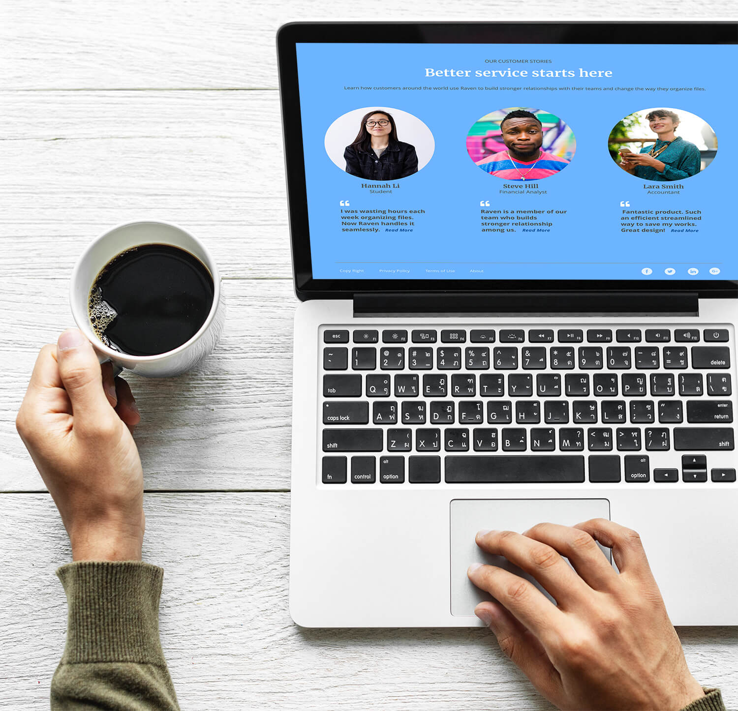
The colors are compatible. Dodger blue as a brand primary color successfully delivers the professional and creative spirit. Some enrichment is necessary, like user testimonials and footer, which I have updated in the finishing touches.
Logo typeface is approved by users, while one user states the font size of this logo is small for the desktop screen, compared with the heading next to it. The balance between logo and content is worth to think over. Dashboard layout design is argued. Some users like the large thumbnails, but others argue that they are too large, and it could be better if put 4 images/previews in one row.
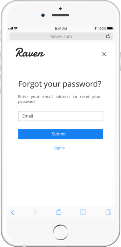
The mobile screens sign in, sign up and forget password is plain and clean. One user prefers to add more details. However, we’d like to keep the page simple in order to draw users’ attention to the sign in/ sign up process. Users would like to see organized and professional pages from a cloud storage product and to achieve their goals with effective and minimal working.
I have completed this design project all by myself, from the research to the user testing. It is not an easy process, but I’m happy with the final result.
I was most surprised by the fact that visual design was just a small part of the project. Throughout the checkpoint, the research and testing took so important places. The product improved after every time of user testing. However, if given more time, I would have refined the logo design. It was not professionally designed. I would have polished the logo.
While doing the project, I learned the full process and workflow of creating a new product. For my future projects, I will try to separate each working stage with different priorities and use the certain time to complete each of them.