DESKTOP, ENTERPRISE
Confident and Effective Curation
An enterprise software has automated data catalog pre-trained by experts
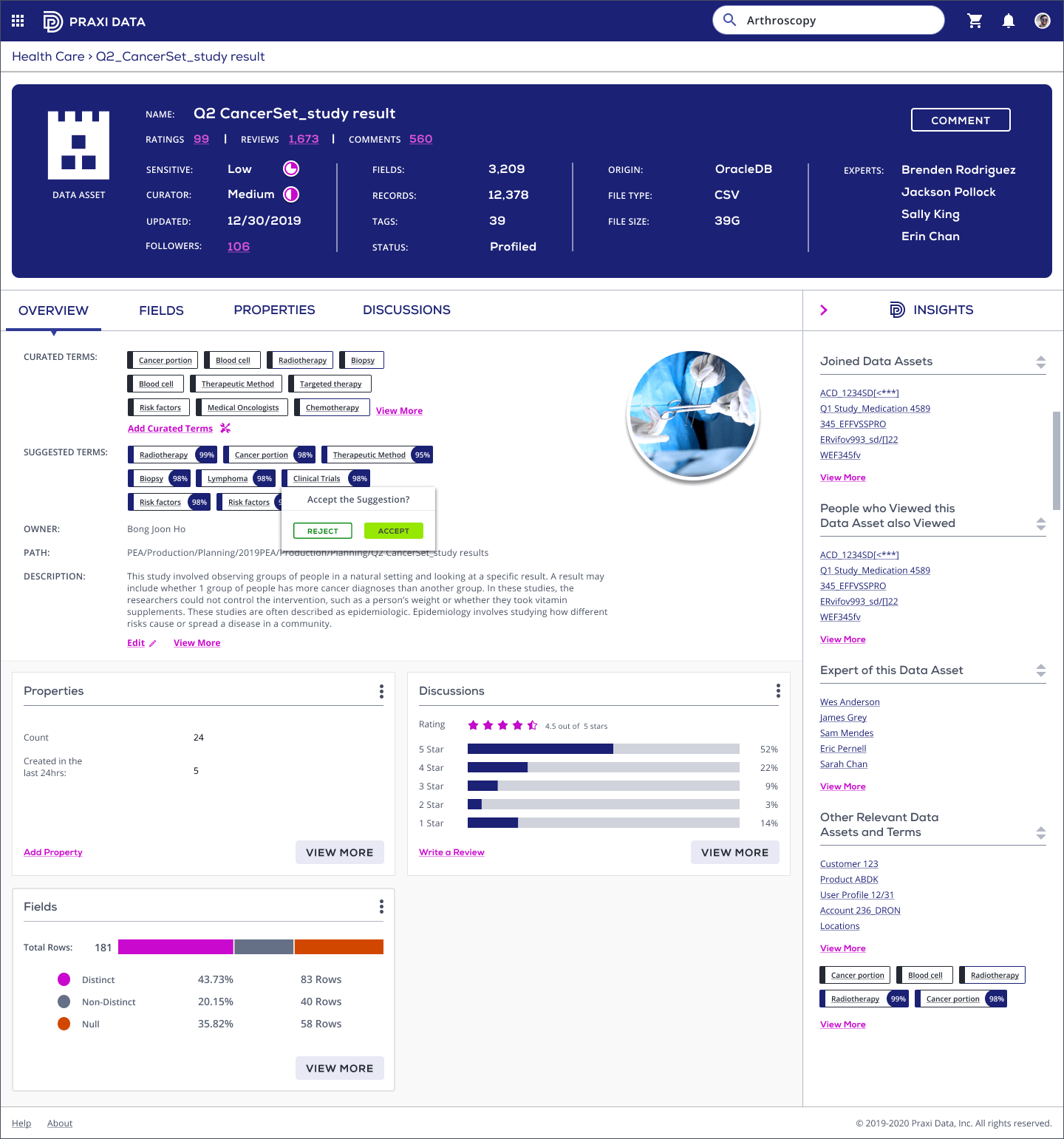
Praxi data provides pre-trained data catalog and libraries, and data steward is one of our primary users. Picking the suggested terms and curating them is one of her main tasks. She needs to pick a suggested term, then accept or reject it to make the curated terms more accurate.
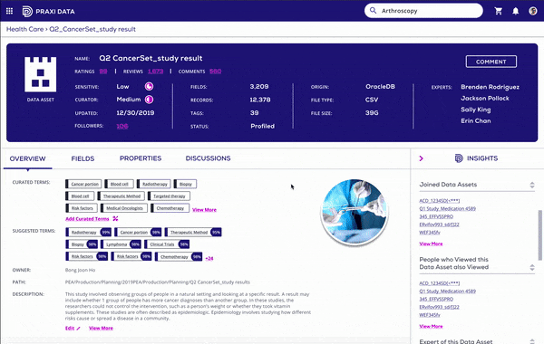
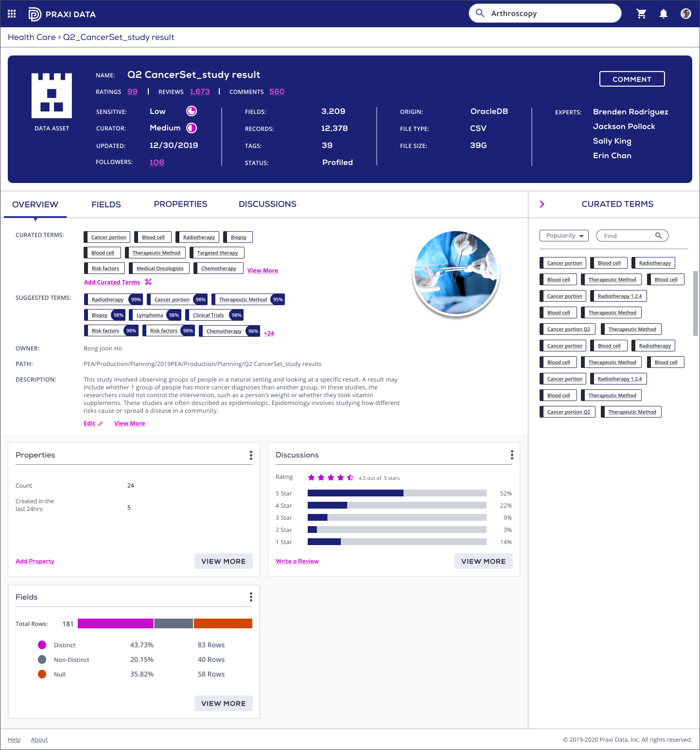
The data asset overview screen has the main information and the insights of an asset, and the most important info among them are the curated terms and suggested terms, which we renamed and redesigned.
We want to increase the confidence level and the effectiveness of the curation process.

UX Design
Visual Design
Research

User Flows
Wire-Frames
Visual Design
Prototype

Figma
Jira
Miro
I worked with the PM and talked with data steward and data platform product manager to learn more about the user needs. As a data steward, her frustration during the curation process are:
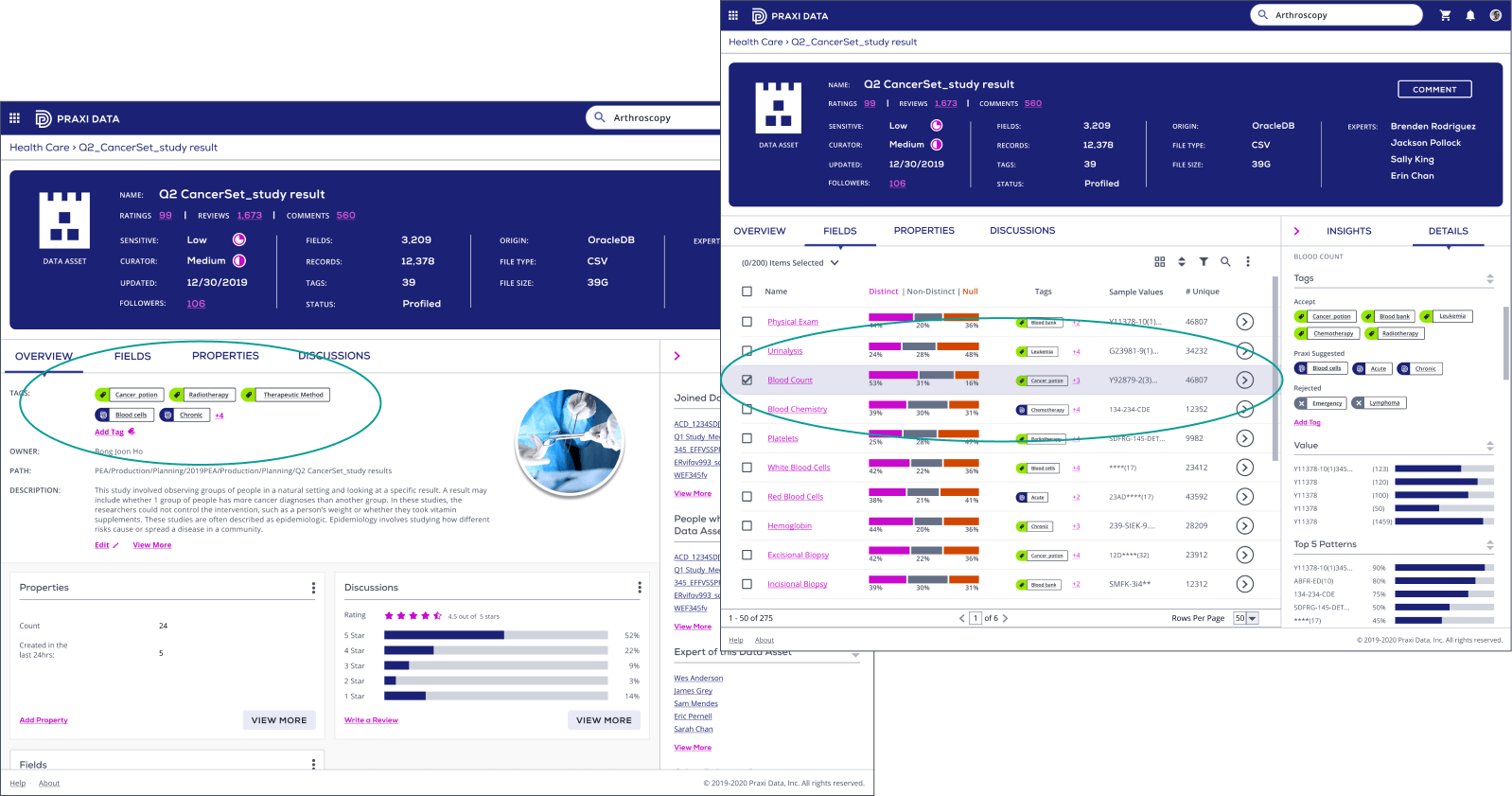
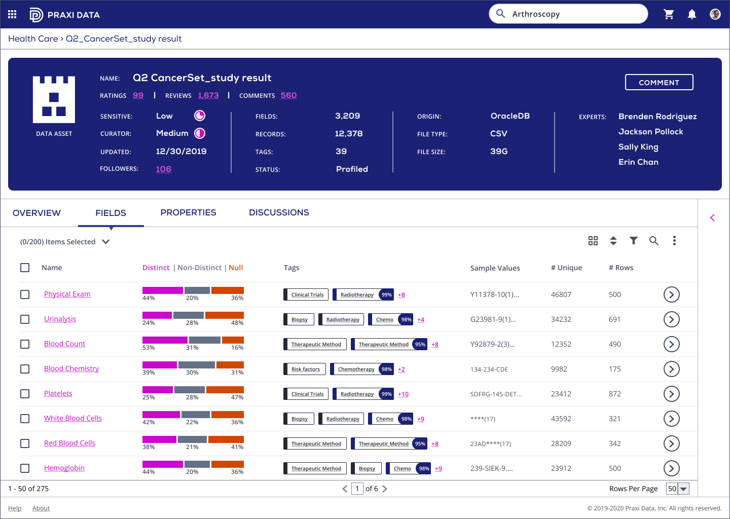
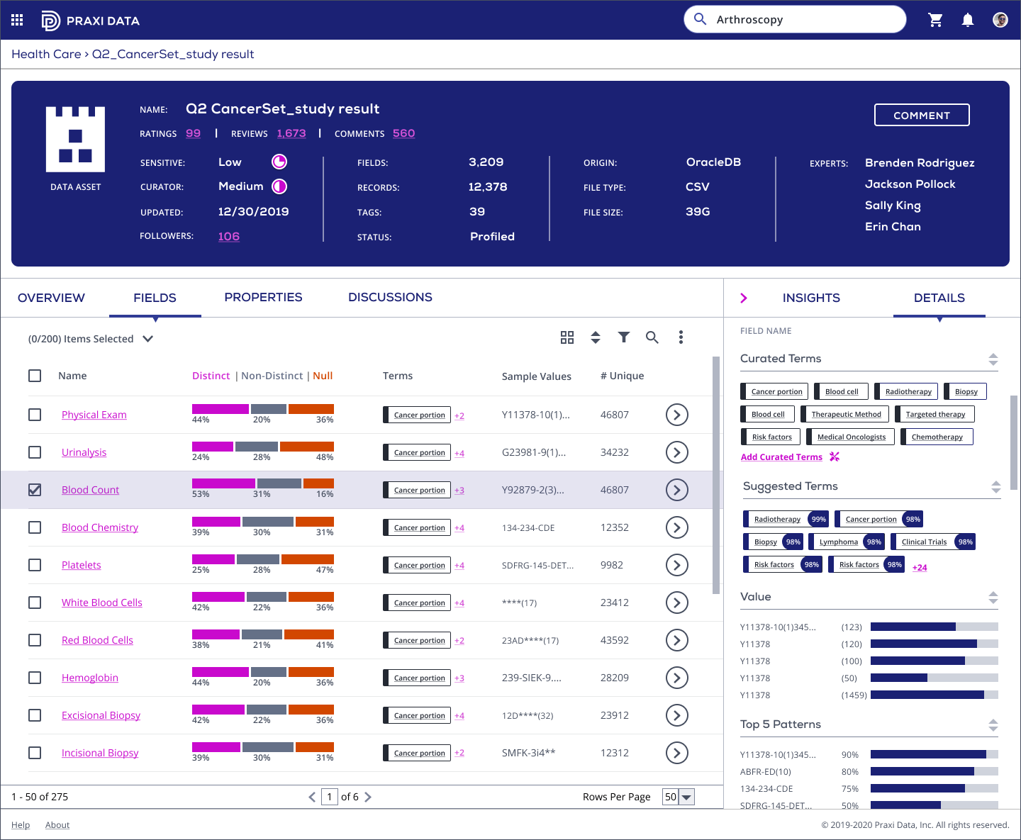
We apply progressive disclosure to display the additional terms in the inspector panel under a new tab titled "Curated Terms"/"Suggested Terms". The curated terms that have been approved by a steward the earliest are displayed more forward, with search and sort features at top.
We use the percentage number to indicate the confidence level of a suggested term, so the user has the first impression of it. A user should be able to click on any of these terms and "Accept" or "Reject" it.
Based on the problem and frustration we found, we decide to improve the confidence level, terms arrangment, and the data hierarchy, in order to clarify and save time for the curation process.
In order to gain more context and provide more friendly and efficient experience, I talked with the domain experts and the users. We found that in the old design, we are not speaking data workers’ language, “tags” can not represent “terms”. And the suggested term should be separated so the data steward can pick the right one to curate.
We also need visual design to show confidence level of the suggested terms, so the user would interact with a high confidence term. Since there could be many of them, the sort and search features could improve the effectiveness a lot.
And last but not least, we need to display children’s curated terms on a separate level to solve the frustration of Lack of visibility into the impact of different data levels. Below are the old designes.
We made several iterations on different parts of the screens. Here is an example of how we apply the confidence level on the term.
Suggested Terms are terms that our AI has identified by scanning the data in the data asset. Each term will have a confidence level associated with it. And the data steward will pick those with higher level. So the percentage is more intuitive, even though the Harvey ball has been used and exist in the design system, It only shows low, med, or high, which does not strongly convey the confidence score here.
Based on users’ feed back, they more like to interact with high percentage numbers. 99% suggested is more appealing than a three-quarter Harvey ball.
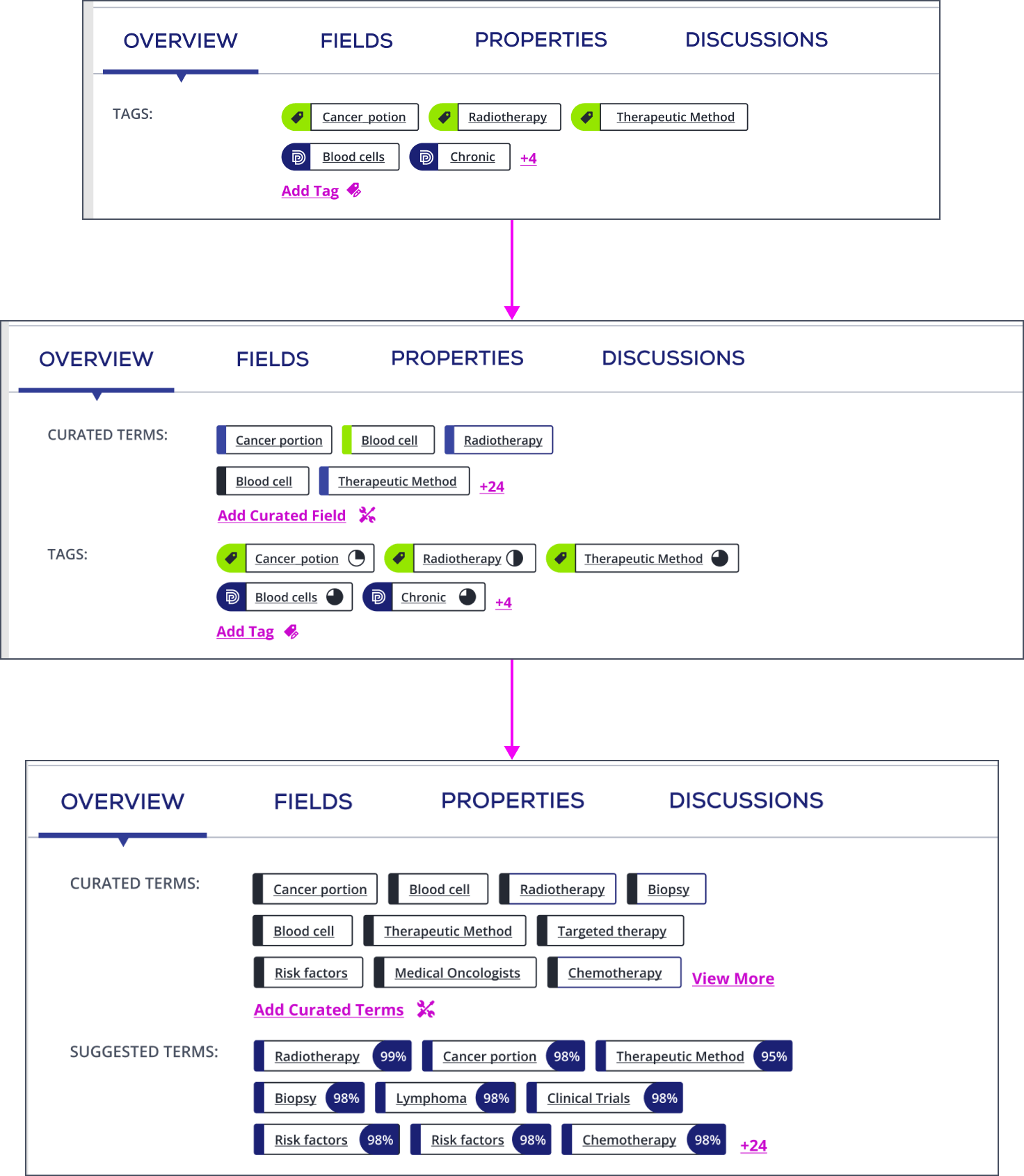
After several rounds of discussion and design review, we decided to take the following design approach.
There could be a lot of the terms so we want to leverage progressive disclosure to display them. By default, display 10 - 15 of them. Provide a call to action to allow a user to "see more". We display the additional in the inspector panel under a new tab titled "Curated Terms"/"Suggested Terms".
The curated terms that have been approved by a steward the earliest are displayed more forward. Once the user views more in the inspector panel he can sort the view by A → Z, Z ← A, Relevance, Popularity (dependent on how much data has been tagged with the term).
Instead of a Harvey ball we use the percentage, so the user has the first impression of the confidence level. A user should be able to click on any of these terms and "accept" or "reject" it. If the user accept the term, it will be moved up to the curated terms section. If he rejects, another suggested term will replace the rejected one.
The designer's journey does not end here. I create the design spec and handoff to developers. Then I collaborate with them on Jira, answer their questions, and QA their work to make sure what they built to align with the design. Since the engineering team joins the project from the early stage, when the design team explores the solutions, we always have the technical constraints in mind, which avoid the afterword struggles.
Most enterprise applications are complex, scalable, distributed, component-based, and mission-critical. With enterprise tools, we are building products that help organizations and their employees do their work better. I’ve learned to simplify the complexity. Starting from brainstorming to stakeholder testing, I collaborate with other designers and product managers to design seamless experience. Instead of jumping straight into Figma, I took time to sort out the context and implications of what I am about to design. By reading data science materials and speaking with domain experts, I have gained knowledge and experience of designing enterprise software and visualizing data validly.