iOS APP
Cinemark Redesign
A movie ticket app for Cinemark theaters
When the Avengers: Endgame released, as a movie fan, I registered the Cinemark movie club at a discount price and began using the Cinemark app a lot. The more I use the app, the more I feel unaccustomed. So I made research and redesigned it.

UX Design
Visual Design
Brand & Identity
User Research & Testing

User Surveys
Brand Concept
User Flows
Wire-Frames
User Testing
Visual Design
Prototype

Sketch
Photoshop CC
Usability Hub
Google Sheets
Google Forms
InVision Studio
The first impression of the app is excess of interference information and lack of focus and hierarchy. After the research, I summed up the problems:
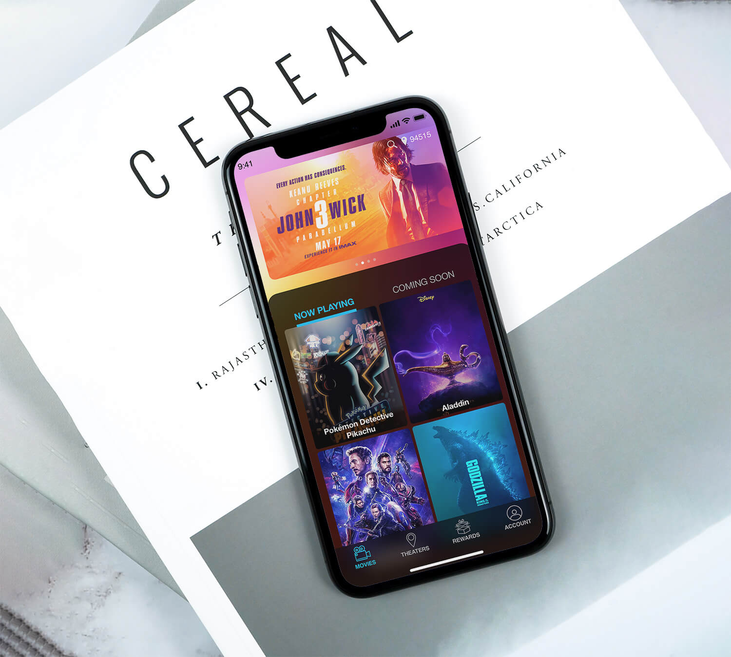
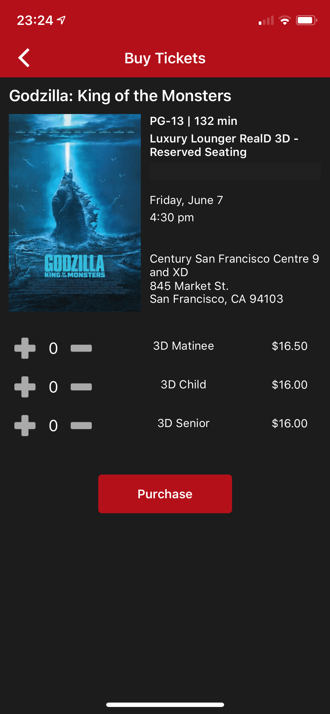
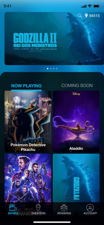
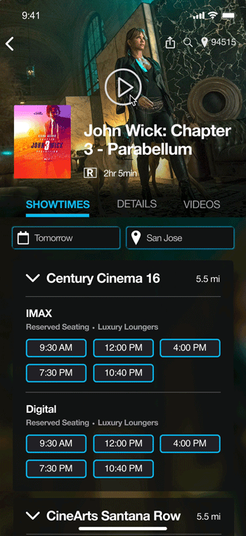
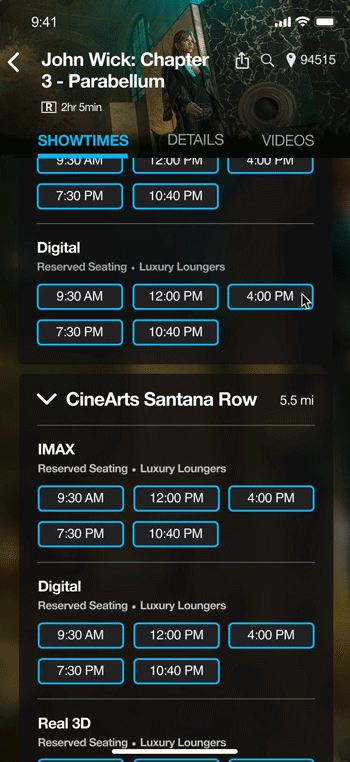
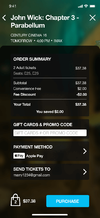
I redesigned the home page and focused on movies which are in theater and upcoming. A bottom bar menu took the place of the side drawer list type menu. The scattered content was integrated into the 4 tab nav bar. The purchase process was improved. Users could check seat availability first.
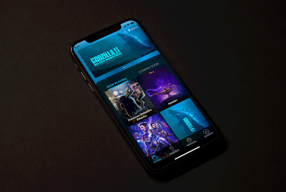
Below is the comparison of the current app and the redesigned one:
Before
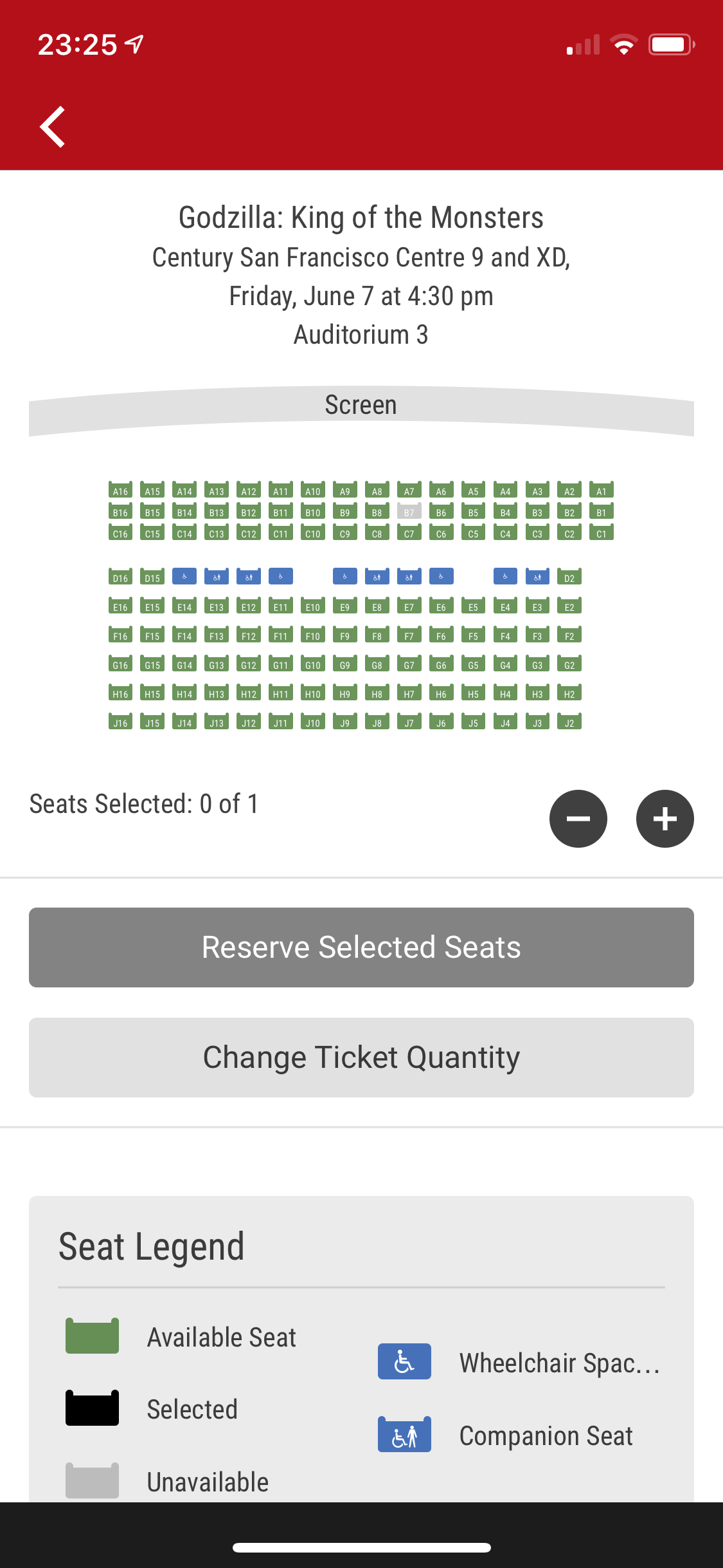
After
Headquartered in Plano, TX, Cinemark Holdings, Inc. is a leader in the motion picture exhibition industry with 547 theatres and 6,051 screens in the U.S. and Latin America as of March 31, 2019. People’s impression of Cinemark is a mid-sized old-fashioned cinema with reasonable price and good amenities but lacks technology.
In order to understand if this was a “me” problem or a “we” problem, I created a user survey.
50% of the survey takers are familiar with the Cinemark app, and all of the takers have been using ticketing apps to purchase movie tickets.
When using ticketing apps, most people expect to see that the movie they’d like to watch is on the homepage. It is easeful to find the movie on the homepage and buy tickets directly through there. Since most people already have the desired movie in mind, and if they couldn’t find it on the homepage, users choose to search it. Only fewer users don’t have a particular movie. They would browse the nearby cinema and pick a movie at the appropriate time.

90% of the users would like to buy tickets in advance, and all users prefer to have chances to pick their seats before going to the cinema. Most users don’t like the first-come, first-served seating system. In order to take better seats, they have to come to the theater earlier, which impede their normal schedule and waste the time. For the same reason, users still go to the box office to buy tickets but less often. If knowing in advance, 65% of the people expressed that a poor seat location would reduce the desire of watching the movie.
Here goes to Cinemark app’s problems:
Cinemark current information architecture and the user tasks:


In order to pin down my final design, I created the wireframes first. The wireframes of the app were ketp concise and focused on showing the in theater movies. Image plays an important role on those screens.
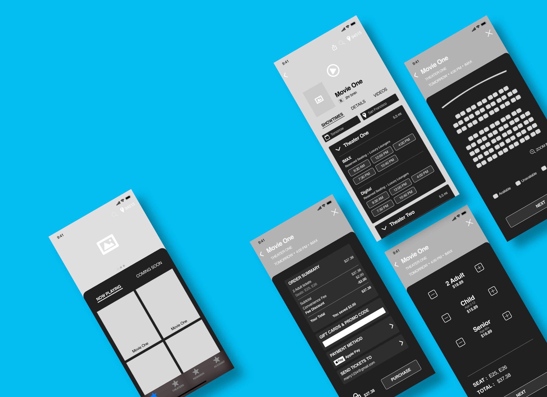
I have two background designs, and I conducted the preference tests to see wether one design favored the other.

The primary colors are black and white, and the accent color is aqua blue (04BEF2). Since the previous red is more like a warning color than an accent color, especially when come to the CTA scenario, I drew the aqua blue into the color palette. The ticketing app has already had plenty of colors from movie posters and trailers, therefore one accent color could do the job adequately. The aqua blue provides good highlight and distinction on a dark background, and convey a calm and placid feeling.