DESKTOP, ENTERPRISE
New Term Wizard Experience
Praxi Data - An enterprise software has automated data catalog
Praxi data provides pre-trained data catalog and libraries, and data steward is one of our primary users. A data steward’s responsibilities include: manage data assets across the enterprise, ensure high levels of data quality, accuracy, security, & privacy, and Manages business definitions of data elements.
Adding new terms to the catalog is one of her main tasks and an important step in managing the data. She needs to define the terms by filling out fields through multiple steps, include the term name, status, description, effective and retire date, etcetera.
We used to employ the inspector panel solution for creating new terms. However this solution is no longer sufficient for future new term creation experience. So I redesigned the experience, the inspector panel was replaced with the wizard experience, in order to increase the capacity and convey our aesthetic and minimalist design.

UX Design
Visual Design
Research
Product Management

Heuristic Research
Information Architecture
Visual Design
Prototype

Figma
Jira
Miro
Balsamiq
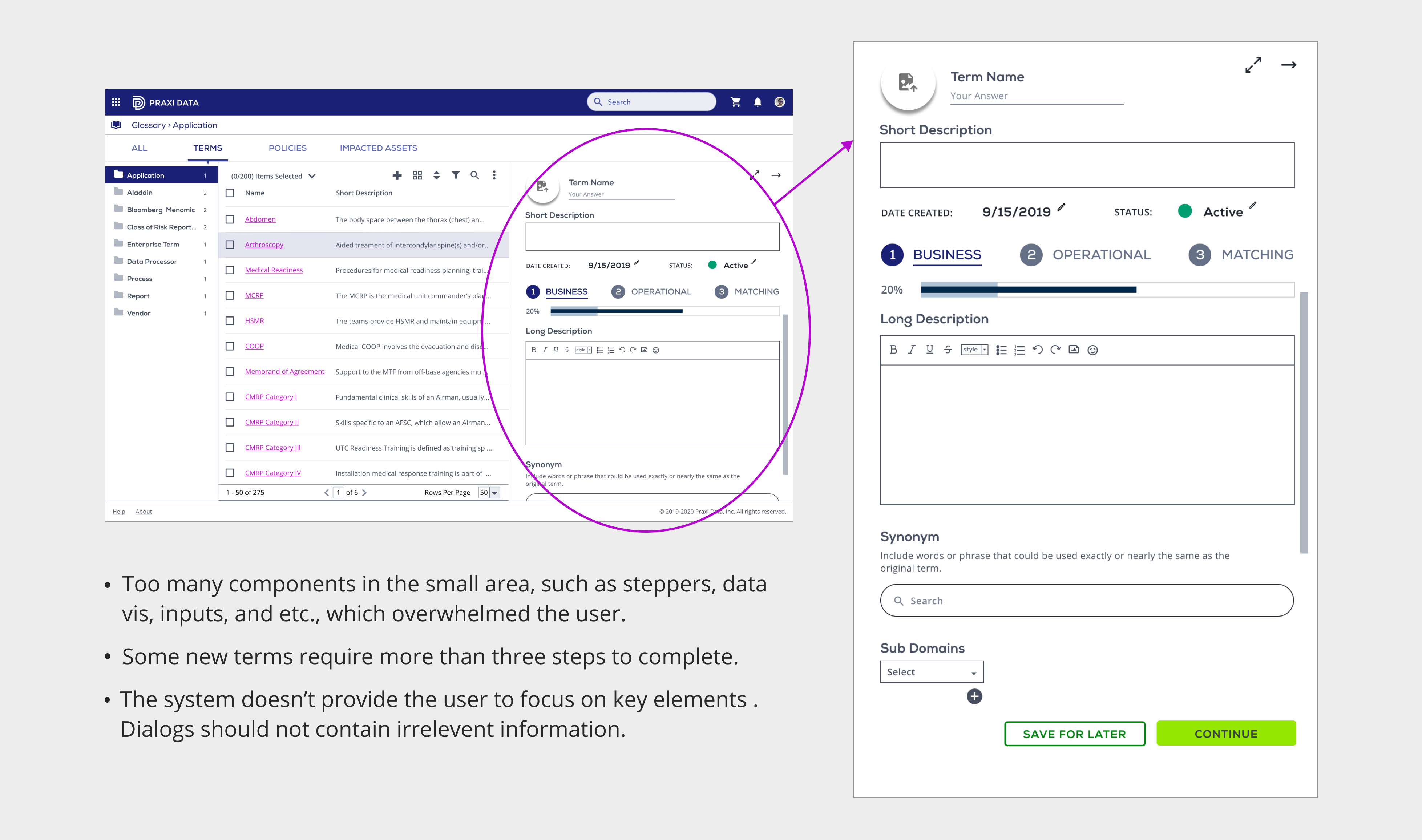
Here is the existing approach. The entire new term creation process happened in the inspector panel, where has too many components in the small area, such as steppers, data vis, and inputs. All those together overwhelmed the user, also are not in line with our design system.
This method doesn’t provide the user to focus on key elements either, since it’s only an inspector panel, the larger space of the screen is taken by the data table.
And besides those, the main problem is some of the new terms will require more than three steps to complete. The inspector panel doesn’t have enough space for that. The design team needs to find a new way to create new terms.
I redesigned the new term creation process, using wizard experience to provide guidance. Wizards can split a complex process into multiple steps which simplify the pages — they contain fewer fields and overall less information, which will increase the capacity and convey our aesthetic and minimalist design.
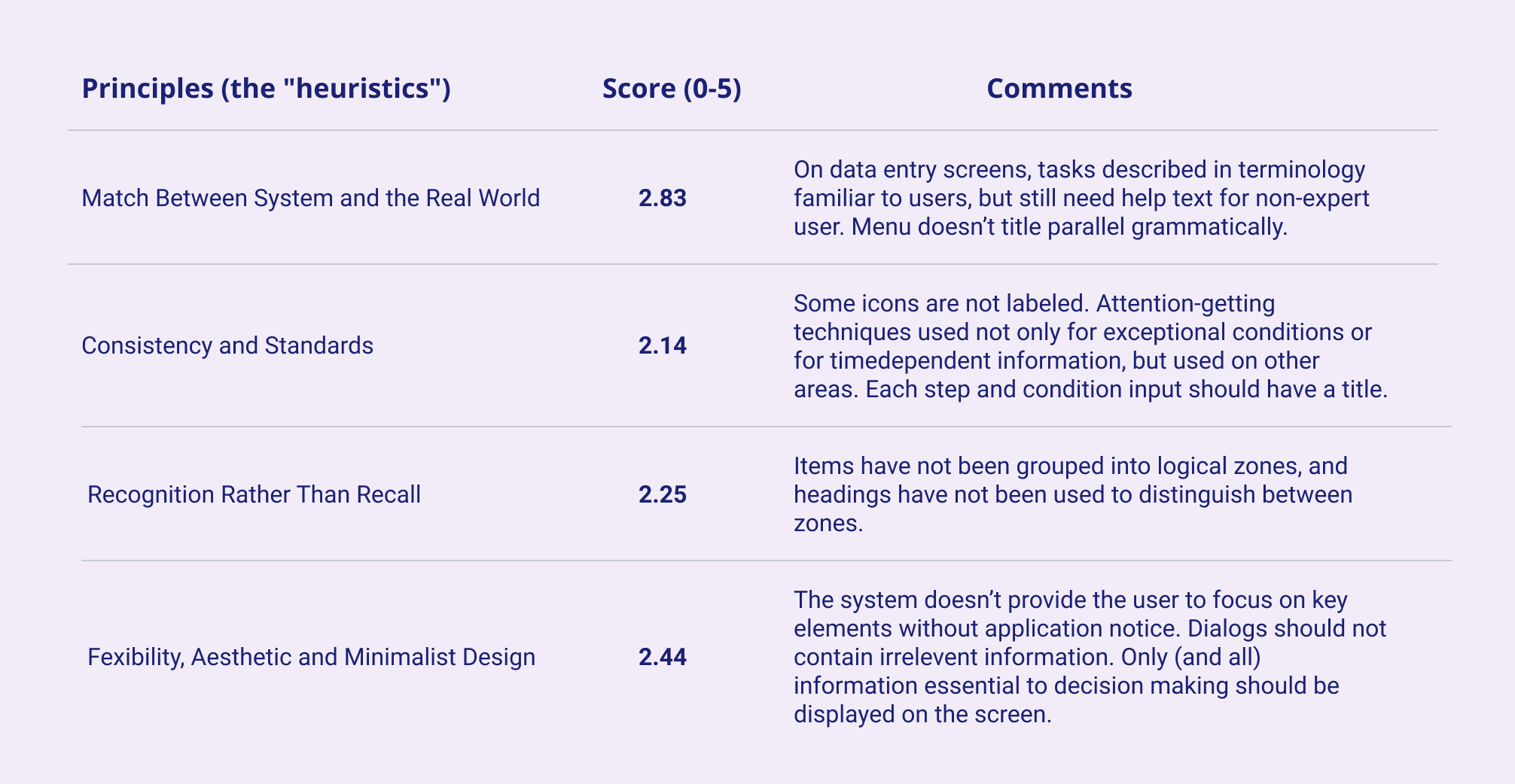
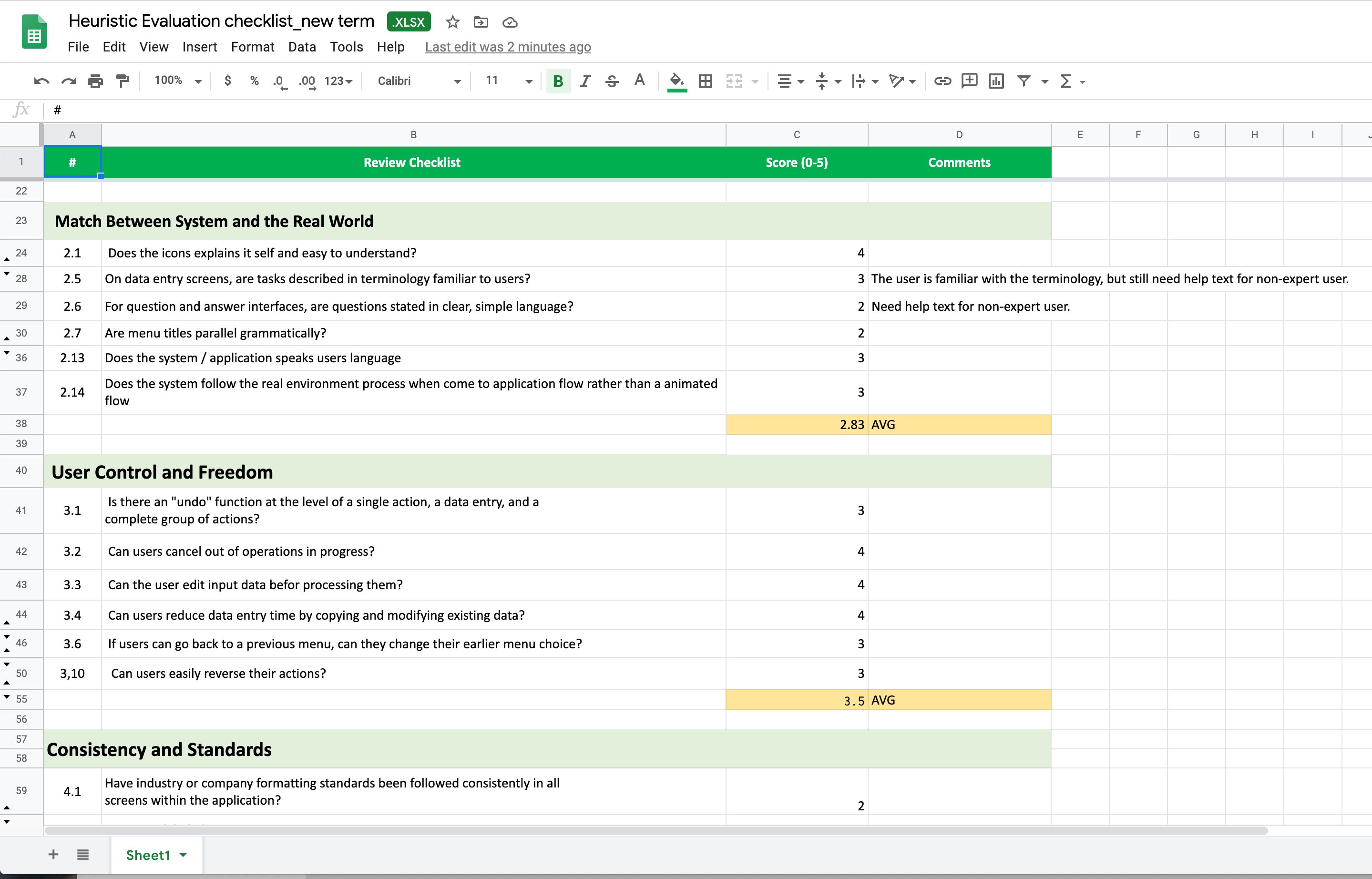
In order to find problems and make the improvement, I used the Heuristic evaluation method to examine the interface and judge its compliance with recognized usability principles (the "heuristics"). I made a checklist and scaled each principle from zero to five. The higher the score, the more in line with the design specifications.
The current inspector panel design got lower scores on many heuristics. Below are some examples. You can tell they are all under three.
For instance, On data entry screens, tasks described in terminology familiar to users, but still need helper text for non-expert users. So we need a larger space to display the helper text for the new approach.
I talked to the data steward and our backend architect, in order to gain more insights and domain knowledge. So I learned that Creating new terms and complex terms are important tasks for a data steward. This process needs to stand out. The process is more complicated and contains different amounts of fields based on different terms.
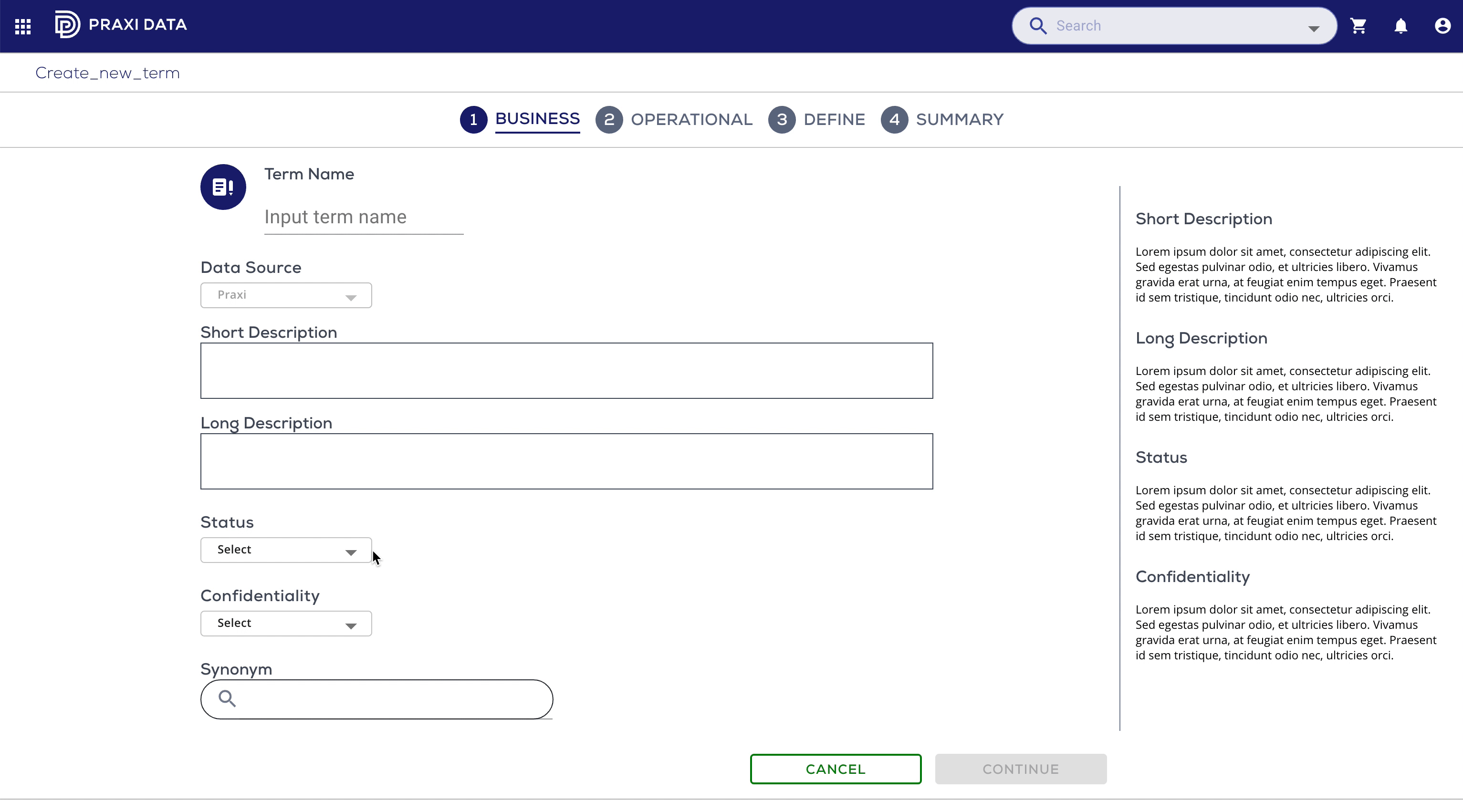
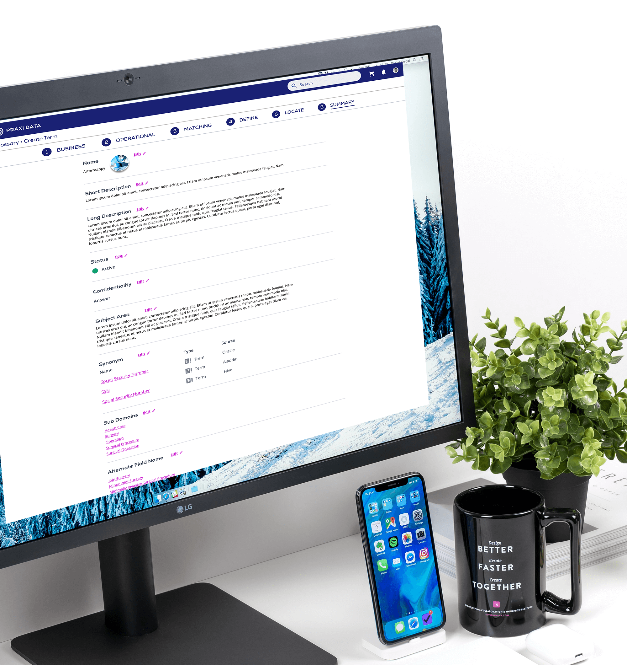
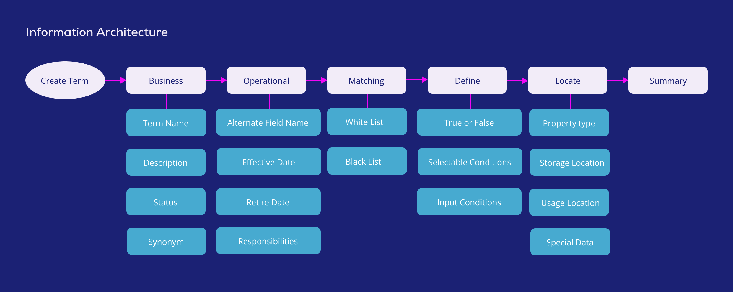
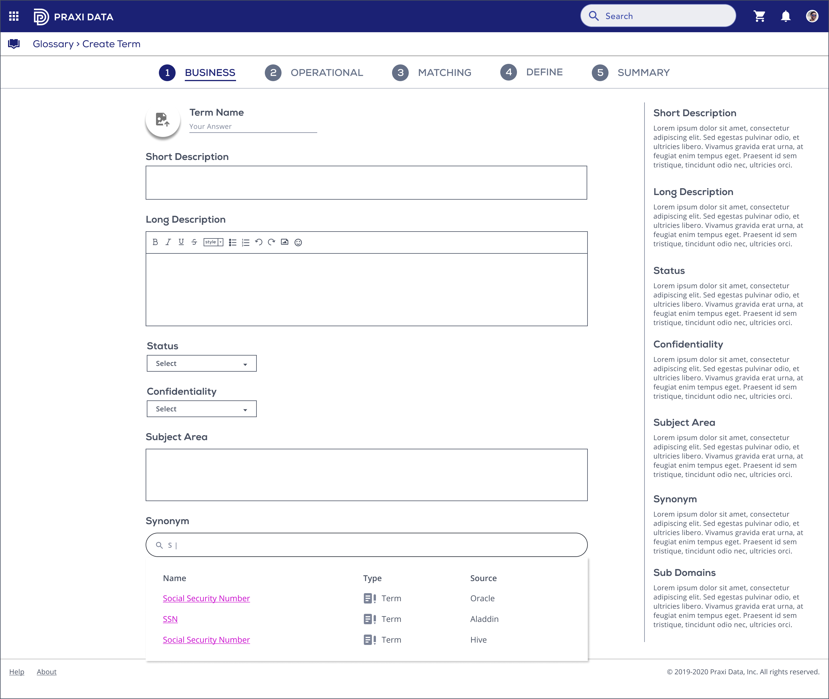
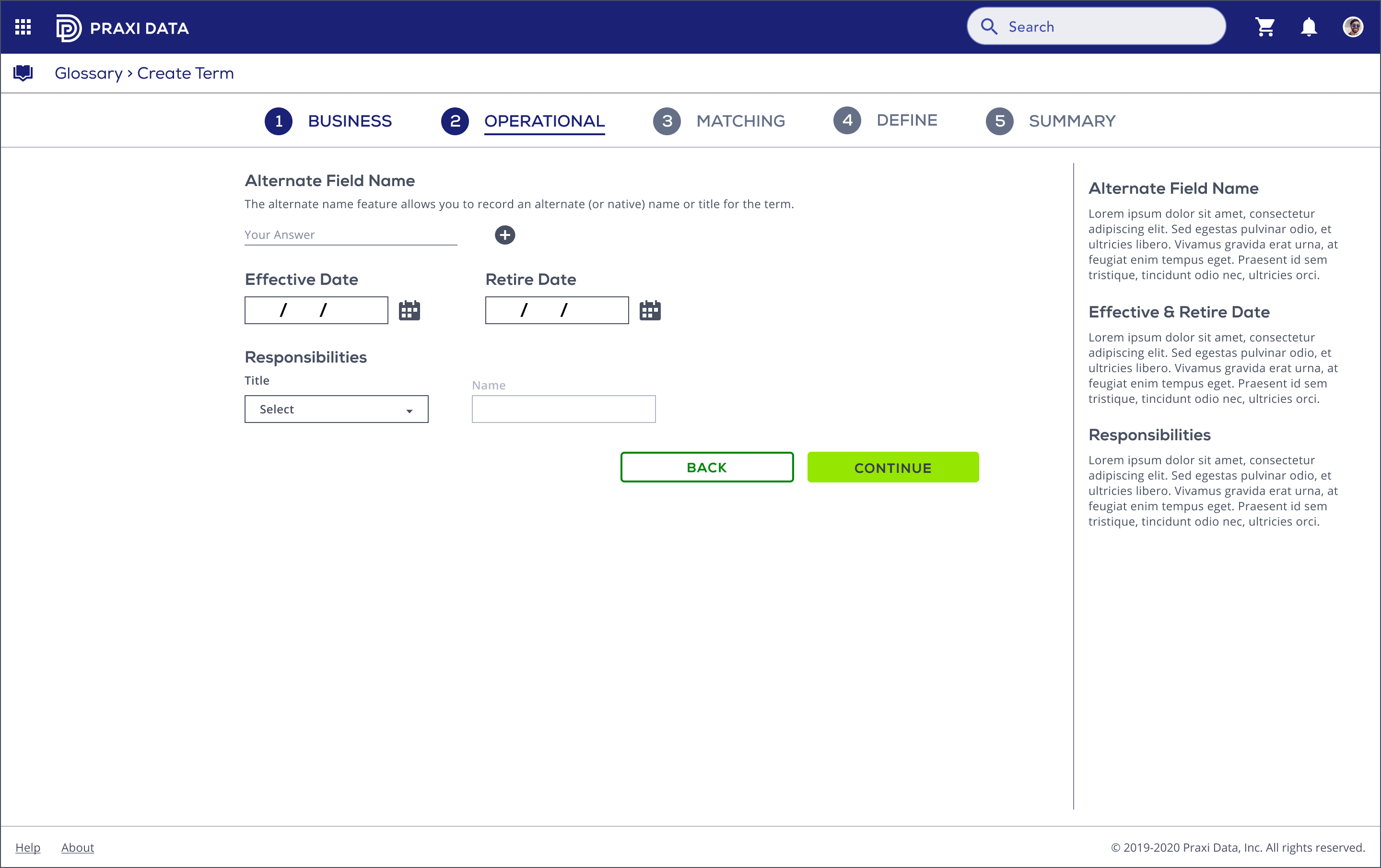
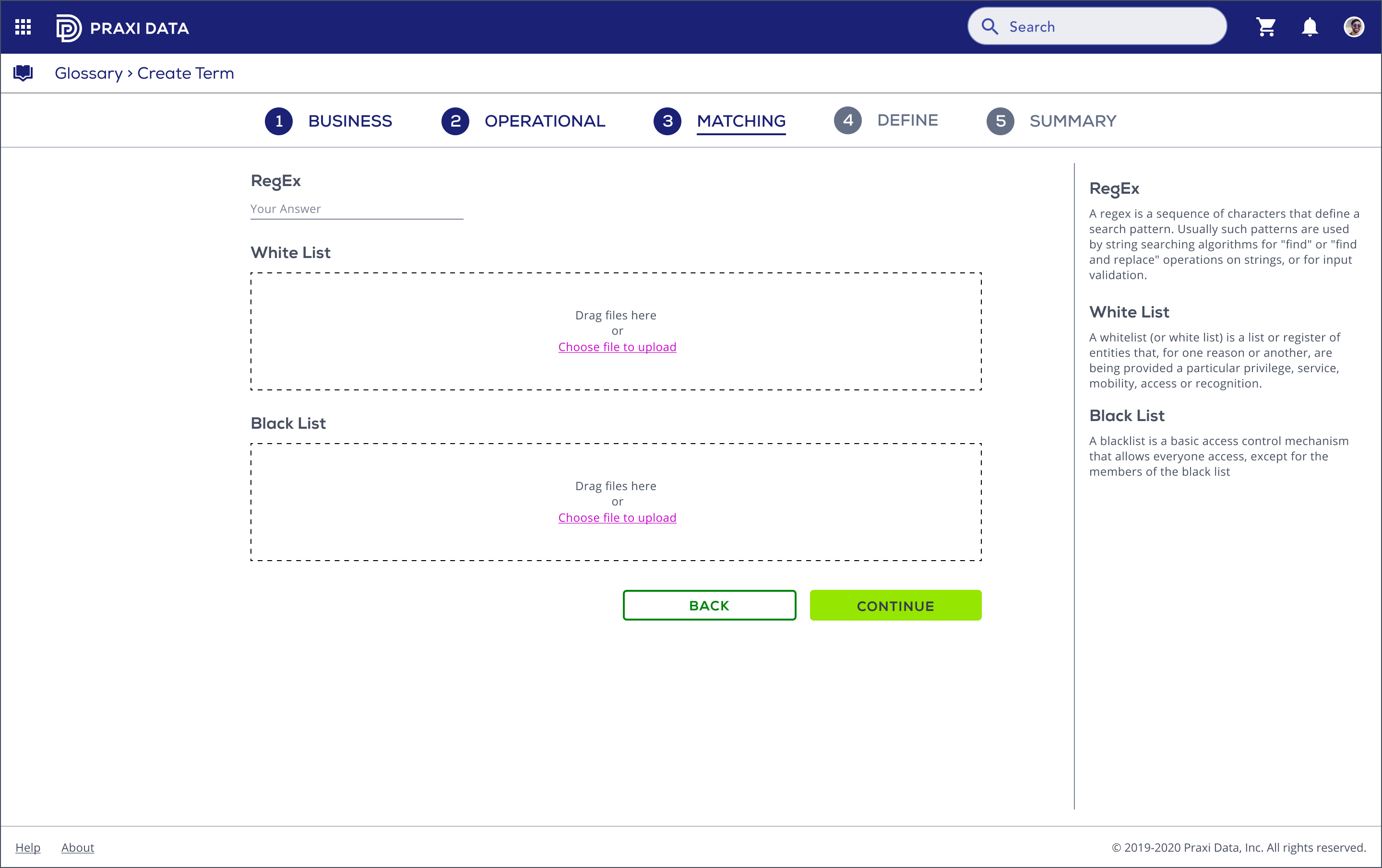
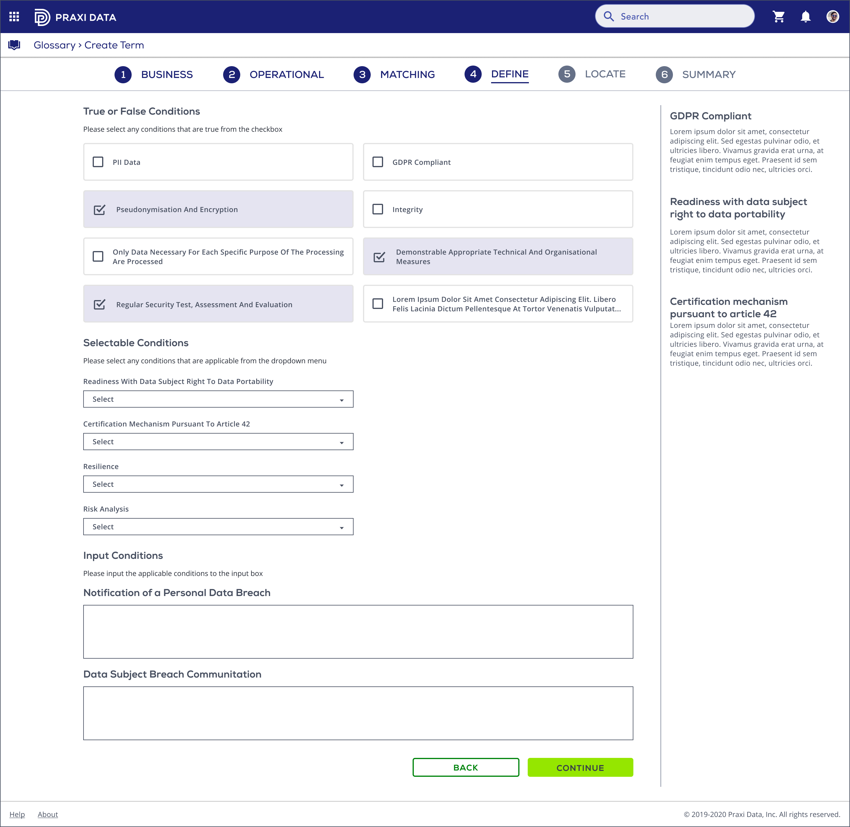
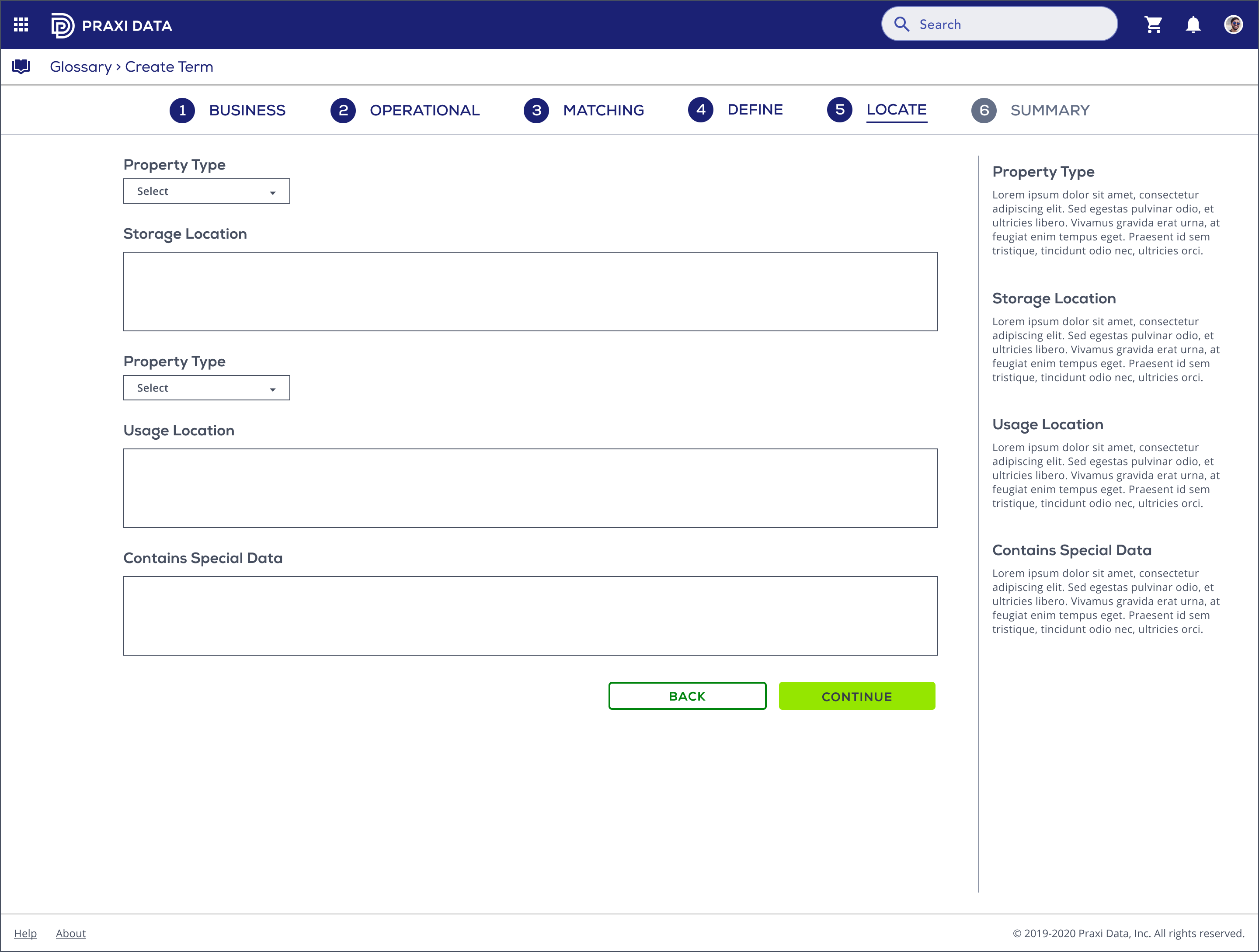
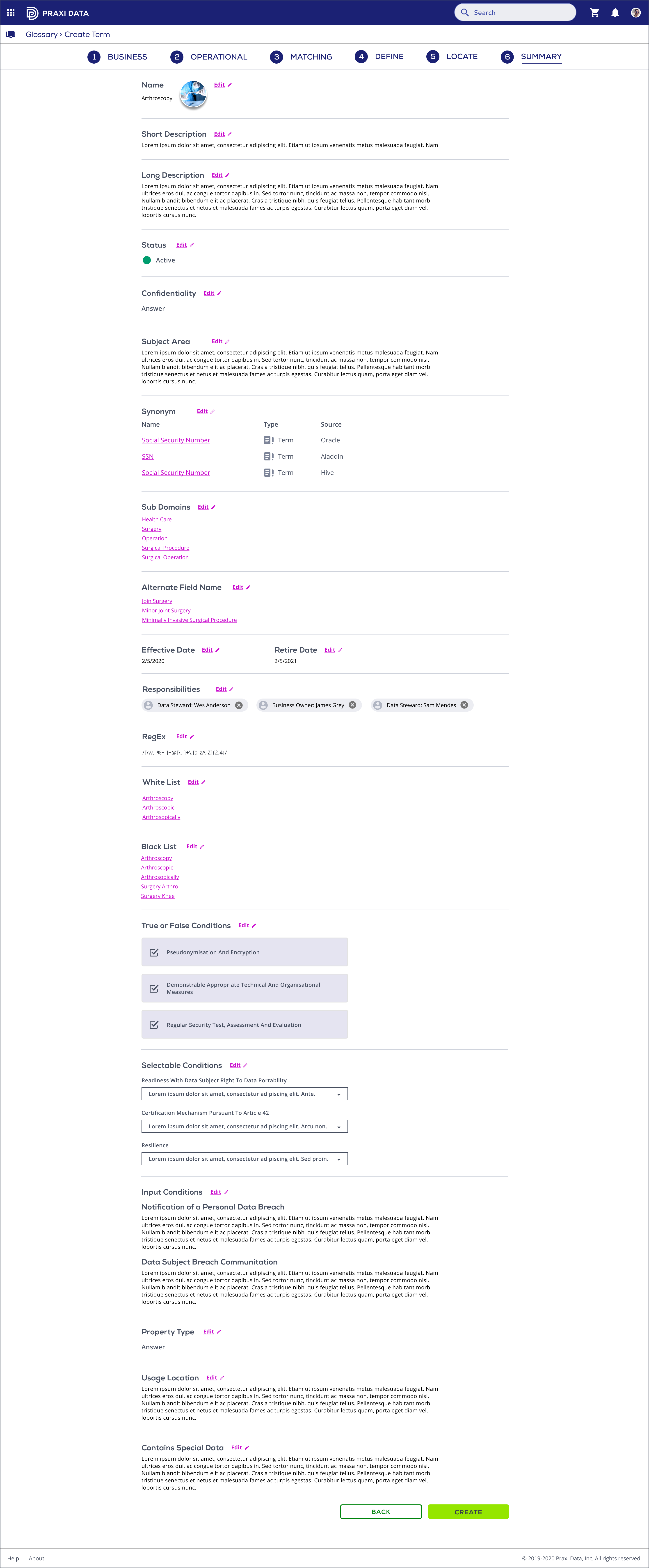
The data steward needs to fill in the information in each step to complete the creation. I synthesized the information and conducted the information architecture. The entire process has six steps (Business, Operational, Matching, Define, Locate, and Summary), and each contains different questions. I reorganized some of the forms to make the content more logical and in line with user habits. Two steps, define and location, were added due to some new terms’ needs.
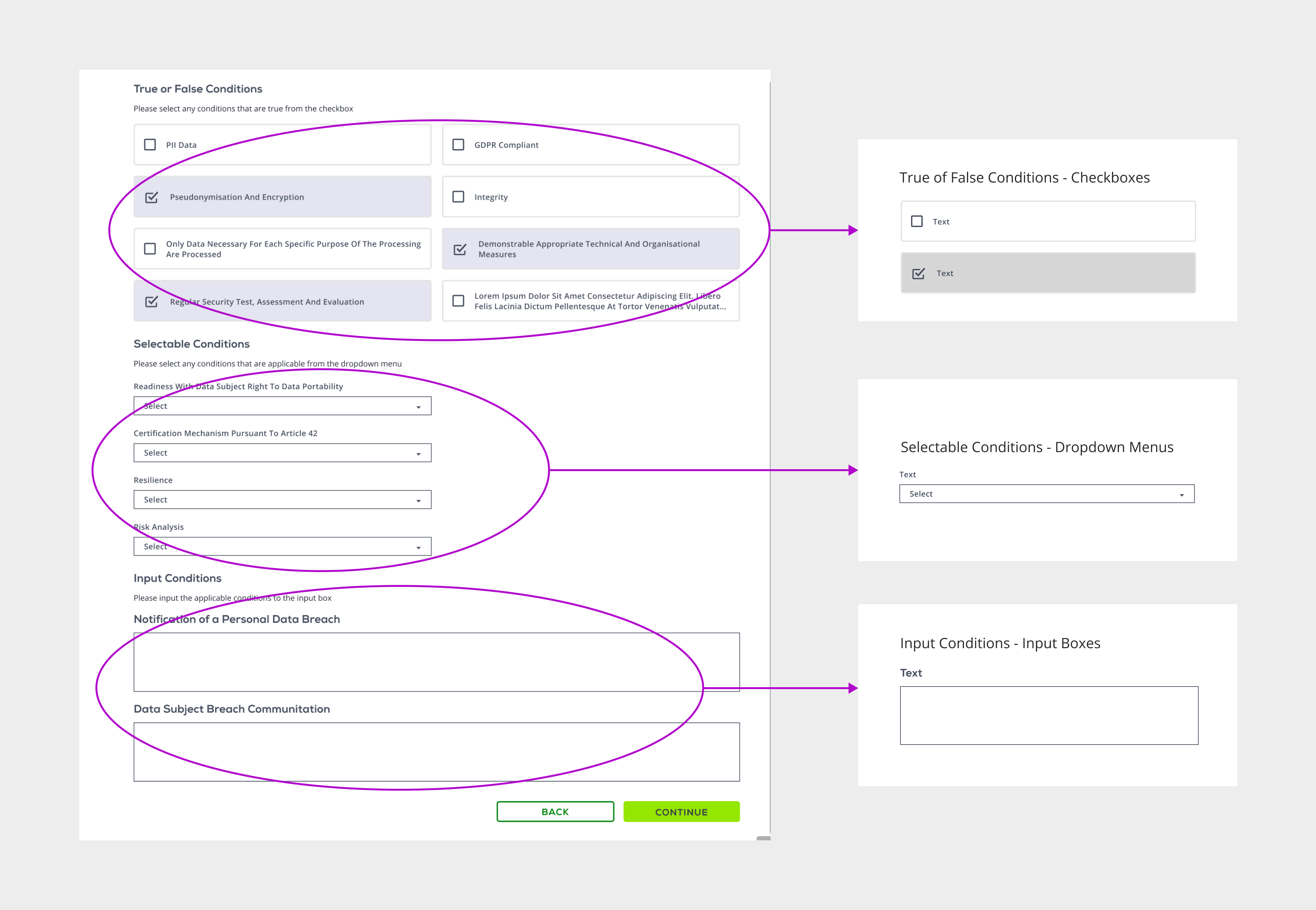
One of the new steps is to define the term, which contains a series of questions. So the challenge for the design team is to arrange the new content to guide the user to smoothly complete the new term process without being misled or overwhelmed.
I asked our data architect, can we sort the questions according to their answer logic in the graph QL. The answer is yes. So to enable users to make appropriate operations, we divided the questions into three parts by the form logic:
For some of the questions, users just need to answer yes or no, for example, "Is this term under GDPR?" So it will be a Ture or False Condition, a checkbox, question.
For some other questions, users need to select the applicable condition. For example, the user needs to select the frequency of the term that is updated, which is weekly, monthly, annual, on-demand, or never, that would be a perfect dropdown question.
The rest questions need the user to input his answer, so we use the input box.
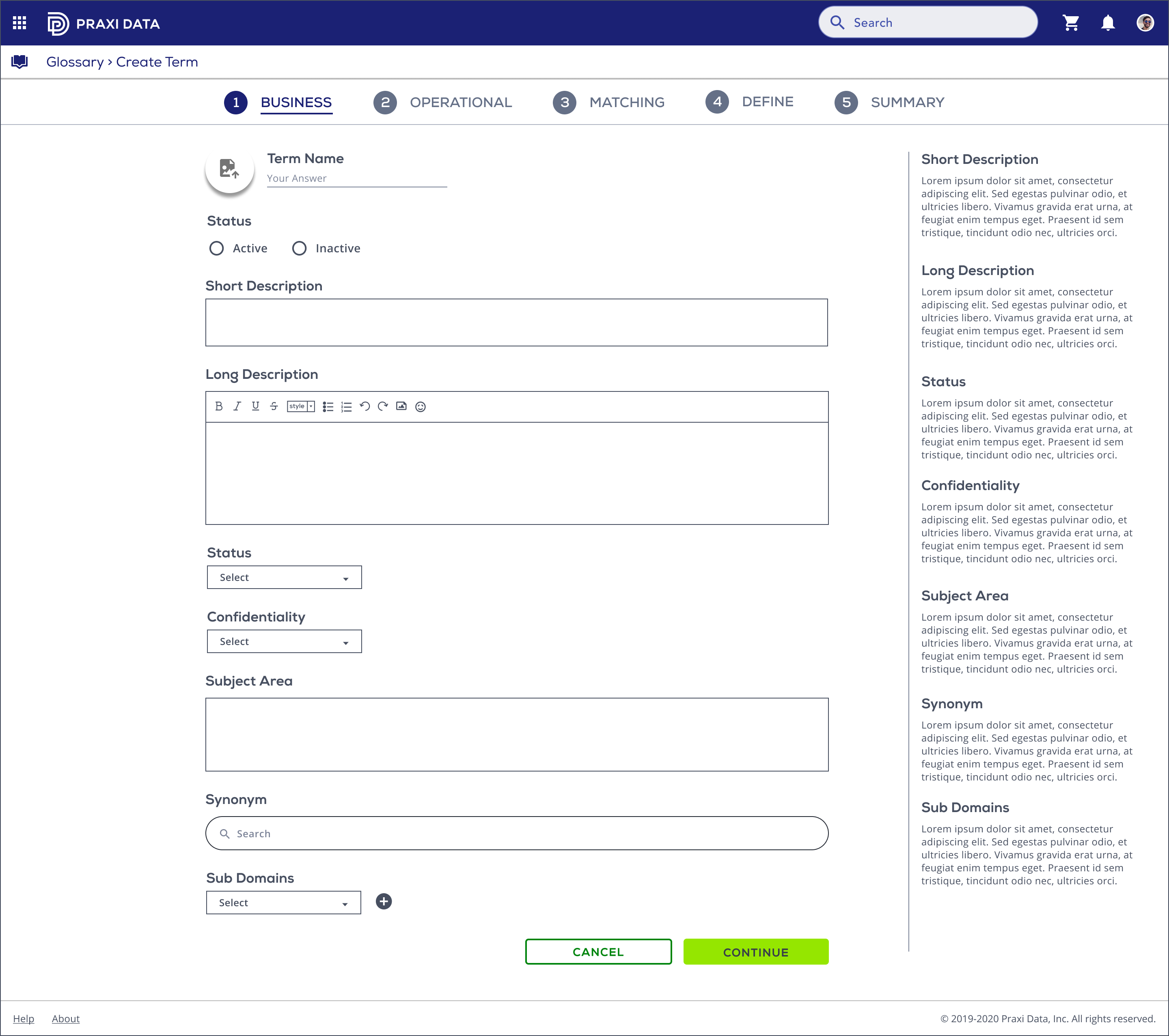
Since we have more steps now, I created the full browser wizard experience to replace the inspector panel. The electronic form is a direct descendant of the real world paper form: a page with empty fields that the user needs to fill in. The wizard is the main application that takes the user through a sequence of forms. The step-by-step process allows users to input information in a prescribed order and in which subsequent steps may depend on information entered in previous ones. It is a good match for the new term creation.
In this process, the questions vary depending on the answers from previous steps. For example, a new term under risk report class has a suggested status and high confidentiality, set in the first step, Business. It may only have two checkboxes and none dropdowns or inputs. However, another term with low confidentiality might have more checkbox options, multiple dropdowns, and inputs. As the user enters information, the system computes the appropriate path for that user and routes the user accordingly.
Because wizards split a complex process into multiple steps, the pages are simpler, which will increase the capacity and convey our aesthetic and minimalist design style. Users end up being less overwhelmed by the process. And we have space to fill up more than three steps.
More screen real estate is available for each step for the wizard experience. When a complex process is split into more straightforward steps, and each step gets a separate page. Targets can be more salient and less crowded, and information may fit on a single screen. Items now have been grouped into logical zones, and headings have been used to distinguish between zones. This is particularly evident in the “Define” step. The right side now has space for the helper text, which provides assistance on how to fill out a field.
Sometimes, done is better than perfect. I tended to get bogged down in details, focusing on the functionality of a part of the system, instead of looking at the big picture. I’m working in an environment where time counts. Both my time and energy are limited. I learned to apply this to my own work: creating cool results can be really simple, done in a few cycles and absolutely satisfy every single of the users needs. The deliverable successfully solves the problem, addresses the need, or conveys the message intended. Then I can prepare the next step and iterate.
